TruScribe’s principles of Scribology that guide our creative content can also be found in pop culture. Certain films provide great insights into the design principles we utilize every day. Here, we’ve compiled single moments from some of the best-reviewed, most popular films of the last century.
Each film provides a strong example of the design principles we use to create content, make recommendations to clients, and make decisions.
Message: The Graduate
(Mike Nichols, 1967)
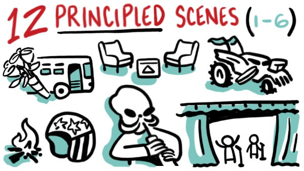
Let’s look first at how The Graduate dealt with the principle of message. The final moments of The Graduate are a perfect non-verbal encapsulation of the film’s message. Having broken up a wedding and escaped together, lovers Ben and Elaine flee their boring lives in a bus. As the excitement of the moment dims, they look at each other, and stare into space—and they don’t look happy. Marriage won’t solve your underlying unhappiness, just as none of Ben’s hollow efforts to do so have to this point. He, and Elaine, won’t find external solutions to their problems. They have to look within, and face their issues.
The message? This couple didn’t just solve all their problems and run away together. They just ran away.
Story: The Matrix
(The Wachowskis, 1999)
Stories are our human coding language. They help us process information quickly, and retain it a high rate. So when visionary Morpheus explains the new world to protagonist Neo in the sci-fi thriller The Matrix, he does it in story. “This is the world that you know,” he begins, and talks Neo through humanity’s shared understanding of how it got to the post-apocalyptic world of the present. Morpheus knows that Neo needs a story, not just facts or graphs. He has to be told about each event along the way to understand.
By providing Neo with characters, motivations, and his best guess at a timeline, Morpheus makes Neo’s understanding as full as it can be.
Motion: Mad Max: Fury Road
(George Miller, 2015)
For proof that motion lets the lizard brain control the eyes and even the head, watch the first 45 seconds of the first major road battle of Mad Max: Fury Road, and try to keep your eyes set on one part of the frame. The film almost gives you visual whiplash with the amount of movement onscreen: cars swerve in and out each other’s paths, flames erupt out of engines and exhaust stacks, and war-painted people with torches and spears leap between vehicles.
During this or any of Fury Road’s signature scenes, just try to look away. Chances are your brain just won’t let you.
Surprise: Easy Rider
(Dennis Hopper, 1969)
When we’re surprised, the brain releases dopamine, a neurotransmitter often associated with happiness. A better understanding of dopamine’s effects—to cause the brain to become and remain curious—comes from one of the final scenes of counterculture classic Easy Rider.
When, in the midst of an apparent celebration, Wyatt suddenly and solemnly tells his road buddy that “We blew it,” the sentiment hits like a bomb. How did they blow it? Why is Wyatt despondent, when they’re so close to their destination? It erases audience expectations and leaves them wondering what’s to come next.
Dopamine doesn’t always make us happy, but it keeps us engaged.
Image Density: Star Wars
(George Lucas, 1977)
When images occur rapidly and frequently, the viewer’s engagement rises so that they don’t miss anything. George Lucas uses this principle to great effect in the bar scene of Star Wars. From the second our heroes walk in, we’re shown frame after frame of patrons from all over the galaxy. Tall, thin, blue, gray, one-eyed, or insectoid (plus a crazy band), the introduction of these images is fast and almost non-stop. In Fury Road, the motion keeps the lizard brain focused to keep track of the action; in 1977, image density kept the brain attentive to see all of the wild alien designs.
Sync: Singin’ in the Rain
(Gene Kelly and Stanley Donen, 1952)
A movie about movies that turns on a studio’s ability to synchronize sound and silent footage, Singin’ in the Rain is the ultimate movie about the principle of synchronization.
When actor (and terrible singer) Lina lip-syncs to the vocals of real singer Kathy, the audience loves her. That is, right up until Lina’s big moment in the spotlight, when Kathy’s friends Don and Cosmo literally pull the curtain behind Lina and show the audience that they’ve been listening to Kathy’s voice. The audience laughs uproariously at the fraudulent synchronization, and the party’s message (“Celebrate Lina!”) dissolves.
Bad synchronization means a distracted crowd and low retention—which might be what Lina wants after her embarrassing trickery is revealed.

Hand-Drawn/Human Forms: Interstellar
(Christopher Nolan, 2014)
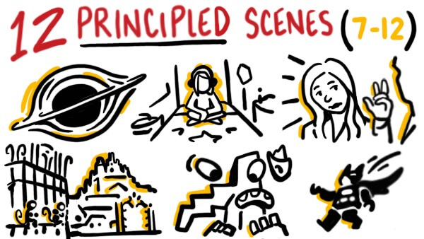
Our eyes are drawn to human forms, and faces in particular. They’re a high-resolution information delivery system that our brains are hard-wired to read. Interstellar uses the protagonist’s face alone to give audiences all the information they need about his internal state. When Cooper watches 23 years of messages from his children in one take, we watch him go from joy to pride, and weep out of both happiness and sorrow. While we see the now-adult children’s faces as well, it’s Cooper’s that holds our focus and tells the story.
Framing: The Royal Tenenbaums
(Wes Anderson, 2001)
When a subject is framed tightly, the audience’s intimacy with the character grows. Especially since tight framing allows our brains even more ability to focus on human forms, it can promote engagement and interest.
In The Royal Tenenbaums, Anderson’s framing of his characters evolves with our understanding of them. When introduced, his characters are almost always in center frame in a long shot; after we’ve had some scenes with them, however, the director shoots characters in tighter and tighter framing. As we understand them more, we get closer to them (literally), and gain insights from micro-expressions and other performance choices we can only see up close.
Voice: Parasite
(Bong Joon-Ho, 2019)
A well-voiced script is a well-delivered one, so a voice actor must provide the appropriate tone, range, and delivery to match the intended message.
In Parasite, we see characters modulating their tone, delivery, and volume to match the changing plot points. As Ki-Woo tells his boss about an art therapist she should hire (who is secretly his unqualified sister), his voice is high-pitched and deferent. In the next moment, as Ki-Woo and sister Ki-Jung approach the rich family’s home, their tones are flat and unaffected, as mundane as any conversation between siblings. Finally, right before they ring the bell, Ki-Jung has them practice a song to remember her fictitious character.
The film place as a premium on sounding correct for the part—a perfect example of the importance of the principle of voice.
Visuals: Citizen Kane
(Orson Welles, 1941)
The first scene of Citizen Kane is a masterpiece of visual storytelling. As the camera glides over long-unused luxury items, security fences, and a gigantic mansion, we learn two things: whoever Kane is, he’s unimaginably wealthy, and he’s extremely alone. With no people and sinister lighting, the images of opulence we see are rendered depressing instead of exotic.
The images match the message perfectly: what was once awe-inspiring is now decayed and untouched.
Geometry: Inside Out
(Pete Docter, 2015)
Our brains love to remember concepts in geometric shapes, sorting objects, and people we’ve seen into easily recallable collections of familiar designs. Inside Out depicted this concept visually when its characters (personified emotions living in a child’s mind) find themselves in the Abstract Thought section of the brain. There, we seem them literally reduced to the brain’s geometric storage forms. As they break down into triangles and bars, we see how the brain remembers imagery played out before our eyes: simply and geometrically.
Color: The Lego Movie
(Phil Lord and Christopher Miller, 2014)
In a movie packed with color, it’s hard to pinpoint an accent color—unless you’re Batman, in The Lego Movie. Escaping Cloud Cuckoo Land’s destruction, Batman and his Lego friends scramble to build a submarine. Batman makes the pieces he needs very clear: black, and very dark gray. Batman knows his accent colors, and so does the audience: if it’s black and/or gray, it means Batman. His accent color differentiates him from the other characters as he builds.
When you see black or gray Legos, look for Batman—those colors signify him alone, and will always appear when the Caped Crusader is around.

