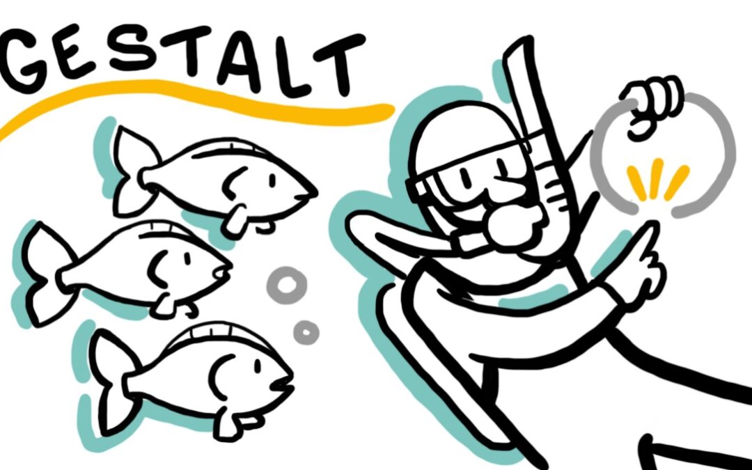
Typically translated as “unified whole” despite being closer to “form” or “shape” in the original German, Gestalt psychology refers to the tendency to “perceive entire patterns or configurations, not merely individual components.” Developed in the 1920’s and 1930’s by Max Wertheimer, Kurt Koffka and Wolfgang Köhler, the movement focused on “questions of order and questions… significance, value, and meaning.”
Meaning, according to Gestalt theory, arises from perception, which, in turn, sprung from the structure and organization of stimuli. It’s no surprise, then, that Gestalt principles were quickly and convincingly applied to elements of visual design. “Professionals in the then-growing industry of graphic design quickly adopted these principles, and designers have since used Gestalt Principles extensively to craft designs with well-placed elements that catch the eye as larger, whole images.
TruScribe’s drawings and resultant videos frequently incorporate these principles. Let’s explore some key elements of Gestalt theory, and see how they manifest in modern video design.
Closure
The Interaction Design Foundation gives us a great explanation of some of the most well-understood Gestalt principles. The first: Closure (also called Reification), which refers to our ability to “automatically fill in gaps between elements to perceive a complete image.” The viewer of a design using made with this principle can “recognize pleasing ‘wholes’ in cleverly placed elements, be they lines, dots, or shapes.”
We leverage Closure often in TruScribe drawings. Our visuals are designed simply, for rapid comprehension, high engagement, and zero distraction. Using minimal lines is one of many ways we accomplish this. By trusting our audience to mentally complete implied drawings, we’re able to both reinforce the client’s voiced message and avoid the ornamental, overly complex visuals that would pull attention away from that message.
Common Region
The principle of Common Region explains the brain’s tendency to “group elements that are in the same closed region.” Using a series of black dots situated on a solid gray background next to a series of dots sitting outside of this background, Interaction Design Foundation proves that Common Region immediately makes viewers see two sets of dots. Despite being identical to the dots outside of that box (and despite their proximity to those other dots), the closed region behind the first set of dots causes viewers to perceive them as distinct.
In TruScribe’s visual communications, the principle lets us create associations quickly and easily. If we, for example, need to depict twenty employees with health concerns and twenty without, we could create forty figures, with signifiers to point out the twenty with health concerns like a cross or Rod of Asclepius. Instead, we often utilize space and open/closed regions to symbolize the difference between the two groups, putting one in a field that clearly and immediately communicates their status.
Common Fate
Cameron Chapman includes a discussion of a newer addition to Gestalt theory: the principle of Common Fate. Ominous as the name sounds, the concept is actually rather straightforward: “This principle states that people will group together things that point to or are moving in the same direction.”
To get an idea of this principle in action, one needs only to look to nature. Chapman uses the examples of flocks of birds or schools of fish—“They are made up of a bunch of individual elements, but because they seemingly move as one, our brains group them together and consider them a single stimulus.”
TruScribe’s whiteboard video drawings don’t literally move; once drawn onscreen, they are not “traditionally animated.” That’s why the principle of Common Fate is so useful in whiteboard—the mind’s quick reading of a group of things pointing in one direction as moving that way transmits the idea of movement. Traditional animation can take a viewer’s attention away from the spoken message, so it’s precisely this idea of movement that enables a one-to-one synchronization of visuals and message without splintering viewer engagement.
Gestalt’s Evolutionary Basis
These are just a few principles of Gestalt theory, applied to design. Each of these insights into perception makes evolutionary sense, and have thus become reliable design approaches. Common Fate, for example, saved early hominids from underestimating threats. An incoming swarm of aggressive insects, say, needed to spur a very different reaction than one approaching insect.
Our early understanding of our environment relied on the principle of Closure. It gave us an understanding of the whole, even if we were left with just parts. Tracking is a great example here. While animal tracks are, individually, simply unconnected impressions in the dirt, our ability to close the gaps and perceive one continuous line taught us to follow that ‘line’ and have a successful hunt.
Common Region also taught us crucial lessons about difference. If an ancient person found twenty berries, identical except for the fact that five had rolled into a dirty puddle, they needed to evaluate the five as a separate and unclean set. The closed region formed by the puddle clarified the difference between the two otherwise identical sets, protecting our ancestors from disease.
Simple, Effective Design
Modern graphic design (and visual communication generally) uses these hard-wired truths, codified through Gestalt theory, to great effect. Scribology, TruScribe’s set of content design guidelines, shares many of the theory’s ideas.
Our creation of simple, effective drawings employs many Gestalt principles, which in turn employ evolutionary and perceptual realities. Gestalt theory urges us to understand our perceptual biases and tendencies. TruScribe utilizes those tendencies to transmit our clients’ messages in a way that is both engaging and retainable.

