What’s your worst fear with your business communications? Is it that you’ll frustrate or anger your recipients? Do you worry that your message is too long, or too short? How about the most important question of all: is your message even clear?
Ambiguity can ruin any communication, internal or external. If a viewer can take home the wrong message from your materials, or find themselves torn between possible interpretations, there’s no way for them to act on that message. In other words, confusion does not breed retention—and action follows retention.
Ambiguity can arise quite easily through writing; that’s why English teachers ask their classes “What do you think the author meant with this scene?” instead of simply explaining the sole meaning. Fiction, though, is not the only kind of writing that can contain ambiguous messaging. Supposedly straightforward instructional writing can succumb to unclear meaning just as rapidly.
When a message is intended for a broad audience, including those whose background with the language differs (native speakers, those who are learning the language, non-native speakers who are fluent, and everyone in between), confusion can crop up quickly. I’ll never forget a mountain hike in Germany where my friends and I saw a sign (in English) that warned that going through a particular shelter door to the outside could lead to a “Danger of Life.”
Of course, we understood clearly that the message was intended to say “Danger of death” or “Danger to life,” and was not implying that stepping out onto a sheer cliff face without preparation would put you in danger of truly living. Too often, though, these kinds of minor differences are far less obvious and more likely to generate misunderstanding.
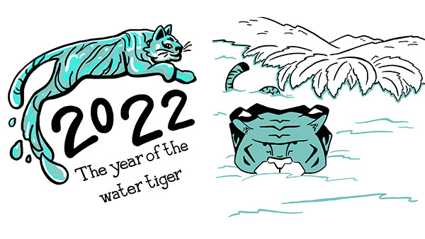
Recently at TruScribe, a discussion of 2022 being the year of the Water Tiger in the Chinese Zodiac revealed an interesting level of ambiguity in how two artists interpreted the words “water tiger” as they approached a visual depiction. To one, the phrase meant “a tiger made out of water,” and to another it implied “a tiger coming out of the water.”
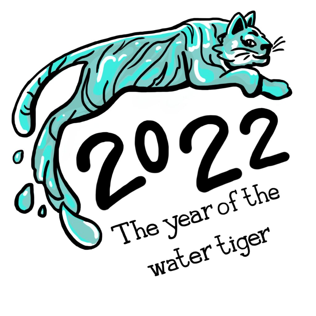

Luckily, the stakes are considerably lower with this kind of ambiguity—there’s no chance that a misread could lead to a tumble down a mountain. Both, however, show that the written word, can create ambiguity. And when terms are more complex, as they often will be in business communications, they are even more likely to generate confusion.
Perhaps the answer is to use drawings, then, instead of the written word. After all, a visual doesn’t require translation… or does it? As we’ve previously discussed on this blog, the relationship between symbols and meaning is often far more complex than we might think.
In researching that article, the most fascinating example I found was the symbol of the skull. It would seem to be one of the most clear-cut, cross-culturally consistent representations of danger, risk, or death. Yet to some belief systems, the skull (and/or skeleton) represent the continuance of life, as bones “outlive” the rest of our bodies. It’s sometimes also seen as the seat of the soul, and more—a decidedly less foreboding and perhaps even reassuring meaning. The image of the snake has similarly wide-ranging meanings, depending on culture, time period, and usage.
We seem to be arriving at a bit of a problem: the written word can easily engender multiple meanings, and visuals can create ambiguity in interpretation as well. How, then, can we be sure that we’re avoiding ambiguity in communications?
At TruScribe, the success of our videos comes from the synthesis of the two. We’ve learned that pairing hand-drawn images with a voiced script creates the clarity of message that our clients need. Let’s consider a few examples.
For a legal topic, viewers of a video might hear the word “justice” a good deal, and this is a perfect case where ambiguity could inadvertently creep in. Is the word relating to a justice, meaning a judge, or to the concept of justice?
An artist might use an image of the scales of justice to imply the broader concept of fairness and legal remedy, and a person in a judge’s robes to denote a Supreme Court Justice. This way, the phrase “Supreme Court Justice” paired with a robed person holding a gavel will not be construed as “the justice dispensed by the Supreme Court.”
In a FinTech video, pairing just the right visuals with the spoken script can ensure that your audience understands even complex, homonym-laden sentences. Those drawings can make even a sentence as (seemingly) purposely difficult as “The principal reasons for raising these principal funds stem from our core principles” comprehensible. With a drawing representing reasons—maybe numbers or shine lines around a leader character—a drawing representing initial funds, and one to represent core principles/values, meaning can be clearly transmitted.
To be clear, of the two examples above, the second is not a sentence one would recommend writing into a script. That level of linguistic confusion and similarity can and should be easily avoided, even when expecting clarifying visuals. However, without clarifying visuals, it’s the kind of sentence that’s almost irreparably silly. Ambiguity and confusion are often not entirely avoidable, especially when relying solely on a voiced script or on visuals alone. When the two combine, however—and combine with one-to-one synchronization, such that the visual is drawn just as the words are spoken—ambiguity can be profoundly reduced. In many cases, it can even be eliminated entirely, providing the best possible boost to engagement and retention for your audience.