It’s natural to think of cinema and video when you think of visual storytelling.
Americans consume an average of 5,000 films in their lifetimes. We spend half of our time on mobile devices consuming videos. At TruScribe, we understand and celebrate the power of visual storytelling through video. Yet there are many more modes of visual storytelling that people have employed for millennia. Let’s look at some examples.
Let’s start with an example from antiquity. Before stories could be told around the world in seconds, creators had to use other methods to convey their messages. For the Egyptians and many other cultures, this meant the visual story came in a very, very big container.
Example 1: Building a Big, Big Story
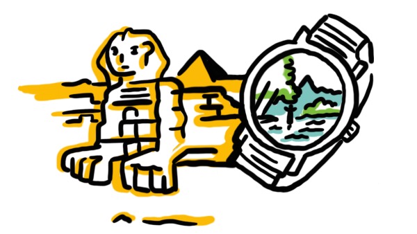
The Great Sphinx, believed to have been built in 2500 BCE, retains a great deal of mystery. Its face bears resemblance to the Pharaoh Khafra. But the structure’s original name and purpose remain the subject of speculation. It may have been a guardian of the nearby pyramids. Or a way to underscore the pharaoh’s power and closeness to sun god Sekhmet. Or even a massive and stylized portrait. It may have been some combination of all three.
Despite some historical uncertainty about its exact purpose, the message of the Great Sphinx is crystal clear. The man who built this has more money and power than anyone who sees it.
Stand in awe and respect the Pharaoh, for this is his legacy, and it will stand long after both of you are gone.
That was visual storytelling in the ancient world: build it to last, to be seen from afar, with its patron’s name (or face) up front for all to see. The ‘seen from afar’ element was particularly important, as it made up for the non-transmittable message. If people can only get the point by seeing it, thought the builders, then build it up to the heavens.
Example 2: A Vacation In Color
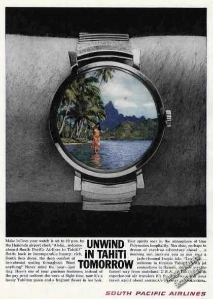
Now, let’s consider a slightly more modern example: South Pacific Air Lines’ 1961 print ad, “Unwind in Tahiti Tomorrow.” A lot had changed with message transmission by 1961, and this ad would’ve run in newspapers and magazines throughout the continental U.S. and beyond.

“Unwind in Tahiti Tomorrow” features an image of a person’s wrist in black and white, on a black background. The wrist prominently displays a silver watch, with a color picture of a woman standing just offshore in tropical waters instead of a face. Below the image is a text box proclaiming the beauty and joy to be found on a vacation to Tahiti.
The black and white wrist and background show the viewer that everyday life without South Pacific Air Lines’ help is colorless and drab. The watch face, your window into Tahiti provided by South Pacific Air Lines, shows the viewer that a full-color life is possible. The text below the image uses fantastical language to underscore the sublime joy of a Polynesian stay, courtesy of South Pacific Air Lines.
Without even showing a plane, “Unwind in Tahiti Tomorrow” combines three visual elements—black and white background, colored watch foreground, and below-image text—to unequivocally communicate that “South Pacific Air Lines will take you away from the boring and into the spectacular.”
The use of color creates another key element of visual storytelling: juxtaposition. Black and white looks normal next to other black and white elements, but looks lifeless next to a multicolored image of a person in a tropical paradise.
There’s also the placement of the color image: it replaces the watch face. What if your routine—the constant checking of your watch—brought you relief and excitement?
By juxtaposing the color image into a space that would otherwise be both colorless and mundane, South Pacific Air Lines cements its message of totally escaping the day-to-day.
Example 3: Robot Reservations
In 2017, as promotion for Fox’s Alien: Covenant revved up, the studio released a short video called Meet Walter. Directed by Luke Scott, the short introduces us to a Covenant character to generate interest in the feature film.
In the video, silent technicians in strange lab clothes and masks assemble a robotic man. Softly swelling music lends an air of wonder to the proceedings. They assemble his plastic body, activate lights, and add microchips and fluid. He wakes up, drinks water, and looks out a window.
When asked, he says his name is Walter. Behind him, text reads “The all-new Walter. Created to serve.” The camera finds Walter smiling with happy people in a lounge. Then, a call to action, superimposed over Walter’s eye: “Reserve yours at MeetWalter.com.” The video closes with fake ad copy next to Walter’s face, including one more push to reserve your Walter.
Reserving your Walter earned you a few tongue-in-cheek email notifications about the feature film, but no robot. And I should know: I clicked the link and ordered a Walter the first time I saw the video.
Of course, nobody expected a robot delivery as a result of their signup. Fans signed up for a Walter because the video made them want to be more involved with Alien: Covenant.
Colors, visual surprises, and juxtapositions drove that desire for involvement. Why are his internal components so unnaturally white or translucent? Why do the human scientists look barely human—maybe even less so than the robot they’re building? And why does Walter look so convincingly human next to his ‘owners’ at the end, when we’ve only just seen that he’s not?
The visual storytelling raises these questions to make you curious. It leaves you with one message: “You’re going to have to see Alien: Covenant if you want to know more about this fascinating character.”
What do these three disparate examples show us about visual storytelling?
In a word: evolution. Tracing visual storytelling through time, we can see not only changes (from statue to magazine) but synthesis (Meet Walter’s effortless blend of color, surprise, and juxtaposition).
Visual storytelling is everywhere, and it has great potential.
The brain has an affinity for visual information and an absolute love for information packaged in story form. As visual storytelling evolves, it gains more strengths: it reaches further, can contain audio and special effects, etc. It also benefits from the forms that have gone before it, so take advantage.
The old adage about knowing your history applies differently to visual storytelling. If you don’t know your history, you’re doomed not to repeat it. In other words, study examples like these to synthesize their lessons the way that Meet Walter did.
Video might not be the only way to tell stories visually, but it’s the most effective mode in the modern world. That’s why TruScribe specializes in video content instead of broadly embracing every form of visual storytelling. Video, however, is where the lessons of these forms can be combined, in new ways, to create engaging visual storytelling.
What examples of visual storytelling do you consider when working on your own?
Do you think a particular form was most helpful in developing the approach?
How will you strengthen your video’s impact with the lessons learned from other video and non-video examples of visual storytelling?

