David Fincher is used to risk. “I am like, ‘If we are not out on the ledge juggling chainsaws, then we are doing ourselves a huge disservice”.
From his early days as a production head through his co-founding of Propaganda Films and rising success, Fincher has never been afraid to tackle a variety of messages and a multiplicity of genres. With those risks have come struggles, like his difficult first film, Alien 3. But they’ve also brought successes like Panic Room, The Social Network, Zodiac, Gone Girl, and the Netflix series Mindhunter.
In our third profile of an influential communicator, we look at David Fincher. We examine his ability to make an engaging story that hammers home a retainable message, movie after movie.
Fincher got his feature debut in horror (Alien 3, Seven). But his thrillers and dramas brought him real commercial and critical success.
The Game, though modest in box office returns, showed Fincher’s knack for design principles like surprise, framing, color, and more.
Panic Room utilized CGI (computer-generated imagery) to reimagine a small space as something more.
And The Social Network used the principles of voice and framing to memorably create the genius/egotist duality of Mark Zuckerberg.
Unlike the writing of Rod Serling, Fincher does not rely on simplicity in design. His stories are complicated, and these complications are reflected in his visual choices.
Complex Design Choices in The Game
The Game is a story of an out-of-touch millionaire playing a “game” that seems to have life-or-death consequences. It has a simple message: wealth doesn’t bring happiness. It’s a message that’s almost too simple—in fact, it’s a cliché.
Fincher’s avoidance of simple visual designs, then, is purposeful. It attempts to distract the viewer from the ultimately straightforward moral. Neon paint, dark San Francisco streets, sun-drenched Mexican cemeteries, and squads of armed men are just some of the varied and vivid imagery Fincher provides.
Narrative complexity and visual distractions also keep the viewer locked in the protagonist’s perspective.
What is going on, and what’s coming next?
He has no time to find a ‘message’ as he runs from hazard to hazard, so the audience doesn’t either. By the end of the film, though, the protagonist realizes the message as the audience does. Its simplicity (compared to the movie that led to its reveal) is reassuring.
Like the protagonist, the viewer feels relief. This is what it was about. And after that thrilling sprint to get to it, it’s nice to have a straightforward moral message rather than another complex turn.
Engaging Visuals in Panic Room
Fincher’s visual preference in Panic Room was less complex or simple and more focused on serving the story.
“As a director, film is about how you dole out the information so that the audience stays with you when they’re supposed to stay with you, behind you when they’re supposed to stay behind you, and ahead of you when they’re supposed to be ahead of you.”
David Fincher
In Panic Room, the visuals control the story by showing the audience things the characters cannot see. The story involves a mother and daughter. They have locked themselves in their home’s secure ‘panic room’ to wait out a break-in. Only they then discover that the thieves have come for loot that’s inside that very room.
Fincher uses CGI shots inside of pipes, ceiling panels, ducts, and technology to alert the audience to story elements before the locked-in characters do.
Viewers worry when they’re “ahead” of the characters. They wish they could do tell them what to do. That worry manifests as engagement as viewers slide closer to the edge of their seats.
The Social Network Finds it’s Voice
In a drama like The Social Network, Fincher directs star Jesse Eisenberg to perform a stylized take on the real-life Mark Zuckerberg. The principle of voice, or having the correct delivery and tone to match a script’s message, is inverted. Fincher has Eisenberg sound very different from the “correct” Zuckerberg impression. Eisenberg’s Zuckerberg speaks in a short, fast, self-assured way that sounds almost nothing like the man he’s playing.
This choice would seem to be antithetical to the principle of voice. But it’s actually deferent to the principle. Fincher realized that Zuckerberg’s quiet, reasonable speech would actually counteract the message he was trying to send. The Social Network’s message is about the contradictions and dualities that exist in people like Zuckerberg. People who can’t be understood as simply “good” or “bad”. Had Eisenberg sounded exactly like Zuckerberg, he would’ve appeared too sympathetic.
To maintain the message, the voice had to be modulated. Eisenberg’s intensity keeps the edge to his character and maintains the balance Fincher wanted to achieve.
Surprises Abound in Fight Club
And then there’s Fight Club. A film “made for both the audience and the film-makers,” the design choices that resulted in Fight Club continuously check the boxes for increasing engagement and making a message retainable.
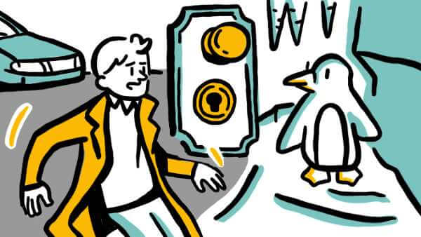
Surprises abound, both in the story and in the visual choices. Think about the moment when the narrator has an audiovisual hallucination of a talking penguin for confirmation.
Fincher uses color effectively when he chooses the accent color of anarchist Tyler Durden: red almost exclusively appears on Tyler. An accent color draws the eye to the most important part of the frame. And if he’s in the frame, Tyler is definitely that most important part.
Fincher Consistently Creates Engaging and Memorable Content
With Mindhunter and other upcoming projects, David Fincher is showing no signs of slowing down. His work, marked by taking risky projects like edgy adaptations (Fight Club), biographies of moguls (The Social Network), and mature thrillers (The Game, Panic Room), shows a master’s understanding of design principles.
With visuals designed to reinforce or even enhance the story, alternative takes on voice acting for a better match to message, surprises in story and visuals, and even the occasional use of an accent color, Fincher’s work stands above his peers. His work continually engages viewers and leaves them with an often-simple message that they will not soon forget.
A good place to close is probably with the man’s own words on how he gets such high rates of engagement and retention of message with his films—focus, and exactitude. “People will say, ‘There are a million ways to shoot a scene,’ but I don’t think so. I there’re two, maybe. And the other one is wrong.”
Film might be about risk, but to Fincher, it’s also about continually making the right design choices.