Let’s be honest: whether DC or Marvel, brand new or famous for decades, superheroes have been a pop-cultural juggernaut for a very long time. Whether we want to trace the popularity of superheroes to their comic book origins, point to early superhero movies that attracted major attention (Superman, Batman), 1990’s cult hero flicks (The Crow, Darkman), or the modern era of the Marvel Cinematic Universe and DC Extended Universe, there’s no longer any room to debate the success of the genre.
So how do these films, and the characters themselves, lastingly command the attention of young and old alike?
Simply put, they’re well designed.
Let’s take twelve heroes and explore how the twelve design principles of Scribology—our guiding ethic in content creation at TruScribe, proven through neuroscientific and psychological research—have rendered them indelible pieces of pop culture.
Message: Batman
Many superheroes have a code or way of doing things, but Batman’s dedication to preserving life is perhaps the most well-known in modern superhero stories.
No matter how evil the villain, no matter how impossible a non-lethal solution might appear, Batman will never take a life. Grounded in the childhood tragedy that led him to become a vigilante, Batman’s code is explicit, as he both says it out loud and performs it consistently throughout his major appearances.
The message inside this code is equally explicit: villains murder, and good people do not. His victories prove that this message is not only uplifting, it’s a functional way to win, and one we’ll always associate with Gotham’s hero. It’s everything we like about Batman boiled down to a single idea—just the way the principle of message dictates.
Story: Wolverine
Wolverine’s story is lengthy and twisting, but for our purposes, let’s focus on his story from the 2017 film Logan (the hero’s real name). Wolverine is aging, and it’s getting harder to be a superhero in a world that no longer wants mutants like himself. He’s now a caretaker for his ailing mentor, Charles, and even his famous powers of healing and fighting are slipping. But a young mutant needs protection, and Logan won’t give up on her or Charles, even if it takes all the energy he has left.
There are notes of classical hero quests, relatable moments of frustration at losing one’s strengths, and the heartbreak of fighting to keep up with a changing world.
Story is our human coding language, and Logan’s story is as human as they come.
Surprise: Rocket Raccoon
Rocket is a talking, genetically-engineered raccoon who likes heavy weaponry and getting paid. He might not sound appealing, but it’s the constant disconnect between his appearance (very close to cute) and his demeanor (very close to amoral) that makes it hard not to love him.
It’s always a bit of a surprise when he talks because he’s got an equal chance of saying something neutral and something awful—and it’s always coming from a tiny, fuzzy raccoon.
The other layer of the dopamine-releasing surprise that keeps us curious about Rocket, however, comes from the fact that every now and then, he says or does something… nice. There’s a good heart somewhere in there, and he surprises us with a glimpse now and then.
And then, just when you’ve got a bead on his goodness, he’s rushing into battle with a machine gun and a grin. It’s a great in-character use of the design principle of surprise.
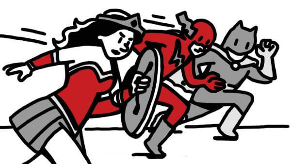
Motion: The Flash
The human eye naturally tracks motion, and the brain can even move the eyes (or head) unconsciously to follow it. The Flash is, for lack of a better description, the embodiment of motion.
In fact, Barry Allen is so fast that we can’t even see him at times; a red blur is the best we get as the Scarlet Speedster races through the streets, but our eyes stay glued to that blur the entire time. Sometimes, the writers even let us see from Barry’s perspective, and we realize that he’s moving so quickly that the rest of the world is literally still.
It’s a world we can’t relate to, but one we’re irresistibly drawn to take in: cups frozen seconds after falling off of a table, coffee mid-spill, stun us as Barry moves, seemingly normally, throughout scenes. Even if we can’t quite get our eyes on The Flash, we certainly can’t get them away from him, and it’s this motion that brings us back to the character over and over.
Voice: Captain Marvel
The principle of voice means finding the right narrator or speaker for your message, and for the message that Captain Marvel is different—in several ways—than your ‘average’ hero is well-communicated through Brie Larson’s performance of Marvel’s dialogue.
The character is a warrior alien from a faraway world, but she looks human and speaks like a modern person (well, a nineties person, but you get the idea). It’s a crucial part of both her performance and the film, as a central theme is Marvel’s dual nature: she’s both alien in biology and human in spirit.
Her physicality exudes inhuman power, so humanity needs to come out through her voice, which Larson chooses to use in a steady, non-stylized cadence.
Voice is the balancing agent for Captain Marvel, and the principle that lets the story work.
Visuals: Scarlet Witch
The principle of visuals, much like the principle of voice, is about matching the appropriate imagery to your message for maximum engagement and the highest possible rates of retention.
With a character like Scarlet Witch, a psychic who can move matter with her mind and more, visuals are crucial to convincing an audience that her abilities are real. That’s why whenever Scarlet Witch does something magical, the audience sees massive red clouds and swirls that indicate her mental powers at work—whether that’s sweeping away poisonous gas or lifting impossibly heavy objects. Especially when she gets in characters’ heads to create psychic nightmares, the character is constantly fused with surreal, enrapturing visuals.
Big ideas need big imagery, and the imagery that surrounds Scarlet Witch is always appropriate.
Sync: Shazam
The synchronization of sound and visual is crucial to maintaining engagement with your content and avoid distraction or confusion in your audience. Unless, of course, you’re willing to go completely over the top in the other direction for comedic effect.
Billy Batson, alter-ego of Shazam, is a fourteen-year-old boy who receives the magical ability to become a thirty-something superhero of impressive stature whenever he shouts “Shazam!”
Actually, to be more accurate, we should say “appear” to become a thirty-something superhero—because inside, Billy’s still fourteen. So when his confused, awkward ideas come out of the adult-looking Shazam, it’s hilarious.
“I’d like your finest beer, please,” he informs a convenience store clerk, certain that he’s pulling the ultimate con; the clerk, of course, is with us, and just sees a weirdly costumed man adding bravado to the purchase of a six-pack.
It’s a great way to play with the principle of synchronization and create a running joke with the character.
Accent Color: The Silver Surfer
The principle of the accent color revolves around the use of a single color as a focal point and a clear indicator of importance. Very few characters are as defined by a single color as the Silver Surfer.
From his surfboard to his skin, he’s entirely and only silver, so there can never be any question as to which elements in the frame belong to him and which do not; any other color must denote someone else. Moreover, the Silver Surfer is the perfect character to fully utilize an accent color: his very existence is an accent, since the story describes him as a harbinger of doom (don’t worry, he’s not always depicted this way). Wherever the Surfer goes, major events follow, so it’s fitting that he should have an accent color to signal his arrival.
It is a focal point for him, and he is a focal point for the narrative.
Framing: Ant-Man
Let’s hear it for the little guy! Ant-Man’s power comes from his suit’s ability to shrink him down to just about any miniature size, and his name isn’t just a reference to his stature. He’s able to communicate with ants, leading a veritable army of the little creatures with him to aid him in his missions.
Framing allows this world of the little things to come to life. With Ant-Man tightly framed in close-up next to an ant buddy or a matchbook, for example, the audience gains an instant visual comprehension of how small he’s become. And when he reverses the suit’s mechanism to become Gi-Ant Man, the framing pulls back to show tiny airplanes, trucks, and other normally-massive scene elements in relation to his colossal form.
Framing shapes our closeness to visual elements, establishes scale, and provides us with an intimate perspective—and Ant-Man’s framing lets us see the perspective of the truly tiny, or the totally towering.
Image Density: Wonder Woman
In 2017’s Wonder Woman, brilliant use of image density reveals the iron will of the protagonist. Image density, or the number of images in a frame, can manage our focus, limit distraction, and more.
In Wonder Woman’s case, it shows us that she truly needs no help to accomplish near-impossible feats. As she runs across an empty field directly into enemy fire in the WWI setting of the film, the frame is crowded with explosions, whizzing bullets, and shots of the army she faces; it’s almost overwhelming how densely packed the frame is, and that’s the idea.
Nobody would walk into that unyielding nightmare alone—except Wonder Woman, who plows ahead through the sea of imagery with gauntlets and shield held high. For while it looks like there’s no room for a person to fit, let alone survive, the defensive powerhouse that is Wonder Woman can both.
Image density creates a contrast between army and hero that lets us see how brave and capable our lead really is.
Geometry: Green Arrow
The brain stores most visual information in geometric shapes, preferring to call up simple designs to help remember things rather than a full, detailed portrait of the image.
Great visual design frequently incorporates this principle of geometry into its imagery, and the Green Arrow is a great case study.
To the brain, he’s a collection of cylinders and triangles. His arrowheads, of course, are the triangles, and so is his hood, rising to a point above his head and dropping to rest on his shoulders. His quiver, the arrow shafts, and indeed his body, are a collection of cylinders of varying shapes and sizes.
You’ll certainly remember his preferred color, but it’s the geometric design that guarantees your memory of the character even more thoroughly.
Human Forms: Groot
Our brains are trained to look for, and at, human shapes and forms.
With a particular focus on human faces, we’re wired from birth to find the forms that look like us—and Groot is a great example because he’s not human at all. He’s a tree.
Well, he’s a tree in human form: he has a face, and a recognizably human body, for all intents and purposes. Sure, he’s made out of wood, and he’s got a variety of leaves and sprouts growing from his bark. He’s also got a strange habit of only saying “I am Groot.” None of this changes the audience’s understanding Groot as (basically) a person. We see arms, legs, and a head with a face; the more unusual parts of Groot’s body take a backseat to his human form.
Using the principle of human forms let the character’s creators make a barely-talking wooden alien into an identifiable character.
It’s tough to think of better proof that the design principles that make up Scribology truly work.