In our previous piece on symbols and meaning, I argued that “the logos of modern brands are modern myth-making.” I stand by it, but wish I’d expanded on it a bit more. Logos provide a vital mnemonic and cultural purpose for all brands who use them, sure—but in that piece, the example brands were almost exclusively corporations like McDonald’s and Coca-Cola.
Today, I’m thinking about a different usage of logos entirely. I’m thinking of art for artists, for business. Okay, that’s probably a little confusing—I’m thinking about band logos.
Lips and Horns: Logos of the Greats
You probably already have a few in mind, despite the fact that the practice has fallen out of favor since the turn of the century (for the most part). Yet this lessening interest in band logos is not a reason to judge them ineffective—quite the opposite. The fact that many of the band logos I’ll detail today already resonate with you proves their value, even after decades of declining popularity.
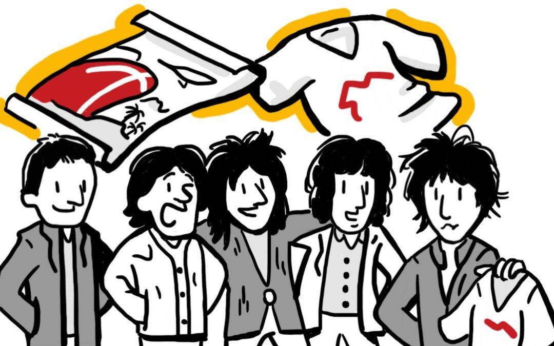
Let’s consider some examples. What do you think of, visually, when you read the words “The Rolling Stones?” Most would see one of three things: band members (almost certainly Mick or Keith), album covers (probably Sticky Fingers), or their logo.
Called “the tongue and lips logo,” “the Hot Lips logo” or simply the “Rolling Stones logo,” the image is an indelible icon. Writing for The New York Times in 2020, Joobin Bekhrad said this of the Hot Lips: “It quickly became ubiquitous, and ultimately, the most famous logo in rock ‘n’ roll.”
Perennially-inappropriate hard rock outfit Motörhead chose the Snaggletooth as their logo. Also called the War-Pig, this snarling, uh, thing was meant to conjure frontman Lemmy’s “primordial nature.” It worked. The Snaggletooth looks the way that Motörhead sounds: aggressive, intense, and exciting.
What did these logos do for the bands who sported them (or, in the case of the immortal Stones, keep it up)? Surprisingly, they all did the same thing. Just because Motörhead never got as big as The Rolling Stones doesn’t mean their logo was designed to do something different.
If They See It, They Will Buy
A logo gives fans a familiar symbol, allowing easy and definite linkage of albums and merchandise to the band. Beyond the fanbase, the logo keeps the band in the public eye, and over time, drives curiosity enough to get people to listen, and become fans.
You might ask—what makes this logo use different from “any brand’s logo?”
The short answer is ‘not much.’ In fact, this is one of the strengths of a logo: its association with stable, successful corporate body. At least in the ‘60’s, the presence of a logo was a piece of branding that truly stood out. What did these guys do to look so professional?
Irony, Sincerity, and Community
The clash between a well-made logo and the gritty, uncontrolled sound of rock ‘n’ roll fit some bands particularly well. The Snaggletooth, for all its ugliness, was a meticulously designed and recreated logo—meticulousness that provided enjoyable irony for fans of the band’s breakneck pace and vicious lyricism.
The Rolling Stones’ logo, though, was made irony-free. Listening to the Stones was meant to be a wild, sexy, unconventional time, and the onstage mania of singer Mick Jagger brought it home. Ever wonder if the Hot Lips were his? You can stop wondering.
By means of irony or sincerity, then, logos were the packaging by which fans knew their favorite bands. That’s still not the whole picture, though, as it begs another question—what was in the packaging?
A Different Kind of Brand Engagement
In other words, are we still talking about albums? Well, yes, but not exclusively, because merchandise in music doesn’t follow the same patterns of consumption that many products do. If you buy a set of plastic pens, you’re not likely to want a T-shirt with the Bic logo. Not many of us get tattoos that read “Microsoft,” and you don’t see a lot of Orville Redenbacher bumper stickers.
The point is that as entertainment, music plays by different rules. The record is the primary product, sure, but live concert tickets are equally important (I’m going to pretend streaming doesn’t exist for a few paragraphs here; stay with me). From there, the offerings go from two to unlimited. People want all manner of clothing, stickers, posters, tattoos, and much, much more.
And the logo goes on all of it. It becomes a shorthand, a callsign. More and more logo-bedecked items proliferate, and finally, signifiers of the band that aren’t even logo-related begin to get around.
Logos in Decline
Indeed, logo use (by bands) and logo-as-signifier (by fans) became something of an ouroboros. By the 70’s, rock bands wearing the logos of their influences, on their own stages. By the 90’s, this was clearly one of the strongest cross-promotional tools in music. With Cobain’s death came the rapid (and rabid) consumption of his favorite bands, stenciled into his notebooks and immortalized in interviews as “the bands that made Nirvana what it was.”
So… where have all the logos gone? It seems they’ve gone the way of rock ‘n’ roll—onto the sidelines, out of mainstream popularity (for the most part). The shift has come as music has been forced, for the first time in a long time, to play by business’ rules.
By that, I mean that the overt sell is a lot harder for everybody—even the greats—in 2022. Streaming and piracy have increased fandom, but not financial commitment to favorite bands. The logo is, functionally, a commitment to the band as a business. It no longer meet the needs of audiences, who are tired of omnipresent branded imagery. It’s not content marketing—it’s just marketing.
In the end, the logo is as good a vestige of the rock ‘n’ roll era as any, and one that absolutely accomplished its goals. Its recession into the background of modern music sales simply shows that even the best techniques run their course of usefulness. The smart marketer, whether working with a band or a printing firm, should be ready to change gears when the market demands it.
Unless you’re the Stones. Then let that logo fly—we can’t imagine you without it.