When we talk about types of visuals or imagery at TruScribe, we’re thinking about how their design will best match the voiced script. Should the accompanying visuals be simple and straightforward? Should you choose ornamented and complicated visuals? Would a maintained metaphor best send the intended message, or should the images be literal in their representations?
While there are few “never” situations with imagery, today we look at these types of visuals as they affect a script—the same script. So, let’s start by creating a short, usable narrative for our experiment.
Let’s invent a company called Milla Industries, whose primary business is the sale of medical equipment to hospitals and clinics. This video is intended for an internal audience. The script functions as an explainer of a new software that Milla salespeople can present to prospects.
The software will make purchasing Milla products faster, which is important to the company, whose revenue has been slowing down. The symbol for the software is a red letter ‘R’.
The short script is as follows:
“At Milla Industries, we cannot afford to slow down in our efforts to meet and convert prospective customers. As part of that effort, we are proud to present the Red Search Engine, or RSE. The RSE is an app that you can give to customers to help them find and select Milla products.
“If a prospect has a question, they can certainly follow up with Milla representatives, as things have always been structured. With the RSE, however, they’ll be able to buy without hassle as soon as they’re ready. We’ll generate revenue faster, customers will be happy with a faster system, and you and other representatives will be able to focus on new prospects.”
Option 1: A Continual Metaphor
Let’s start by telling our visual story with a maintained metaphor—that is, a metaphor that persists throughout the entire visual story. Here, Milla Industries will be a shark—it “cannot slow down,” after all.
Our first challenge comes in the first sentence: how do we represent the prospective customers?
If Milla is a shark, are the customers… prey?
That’s probably not how you want your staff to think of clients.
Now, we need to introduce the RSE, which the client needs to be represented with its red “R” insignia. Since Milla is a shark, this will need to be something the shark acquires to… hunt better?
That idea, too, is problematic, twice: first, sharks don’t use or gain tools, and second, the tool itself is to help the customers and Milla. Sharks aren’t known for arranging mutually beneficial arrangements.
This metaphor gets worse—who, in this ocean setting, “follows up” with sharks? And if we’re still considering customers as prey (still a bad idea), what are they using this tool to order?
Option 2: Complicated, Involved Imagery
Let’s drop this dysfunctional metaphor and try the script with more complicated, involved imagery. Milla, this time, is introduced in a crowded office space, with salespeople scrambling to close deals on their phones. Multiple colors pop out at different places in the frame, and designs are intricate and eye-catching.
We see the RSE in extreme detail on an iPad, sitting on a representative’s packed desk. We also see customers using it, step by step, and representatives freed up to explore outside the office into the sunlit streets to find more prospects.
Did that feel a little over-the-top? It should.
This kind of fixation on detail, or what some call ornamentation, certainly looks great—so great that your audience might not pay attention to much else.
When confronted with visual information and auditory information at the same time, the brain will naturally bias towards the visual information.
Complexity breeds loss of message, far too much of the time. This is why TruScribe uses color, for example, not to “pop out at different places” but to accent specific, crucial elements of the frame that reinforce equally vital points of the voiced script. Complicated designs might not cause viewers to immediately revolt at the awkwardness, but it’s likely they won’t even realize how much of the script they’re missing.
Option 3: Simple, Literal Imagery
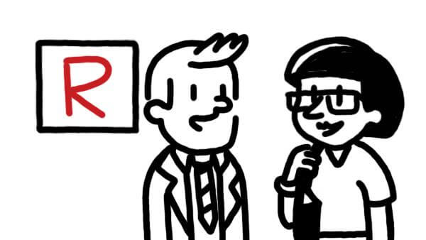
Let’s try our script one more time, this time combining two stylistic approaches: simplicity and literalism. In this mode, Milla Industries is, well, Milla Industries—a nice-looking but simply designed corporate headquarters. Its sales representatives are straightforward human figures. The “cannot afford to slow down” clause is rendered as a CEO pointing to a downward-trending graph.
The RSE is a simple box with the letter “R” clearly visible in red—the only color in the visuals, used purposefully to draw the eye to crucial areas of the frame like the RSE. Simple, casual clothes distinguish customers from sales representatives by their simple casual clothes.
In this third example, our simple, literal images work well and avoid the pitfalls of metaphor and complexity. The literalism negates the awkwardness of a maintained, strained metaphor, while staying interpretive enough (the RSE is likely not actually a box) to remain engaging and eye-catching.
The simplicity of the figures allows for quick comprehension of the characters and their meanings, and the lack of ornamentation and complexity means viewers will be focused on the right part of the frame. They also won’t miss out on spoken messaging through visual distraction.
Key Takeaways
Can metaphor work? Absolutely – as long as your metaphor doesn’t clash with the rest of your message or script.
The same is true for complexity—now and then, it might work, but make sure that any time that you use it, you’re willing to risk losing your audience’s focus on your message.
That’s really the best word to describe metaphorical and complex design types in visual storytelling: risky. They’re not impossible to use, but they do add some concerning variables.
Literal and simple image designs, by contrast, are far more reliably functional. That’s why at TruScribe, we embrace simplicity in particular. Our key concern is your viewers’ engagement with, and retention of, your message, and our designs flow from that concern.
What kind of designs, of the four above, do you think sound most effective? Do you think metaphor can be as effectively as literal representation? Do you agree that simplicity is a smart way to design, or do you have a reason to favor complexity? How do you ensure that your viewers retain your message?