While we’ve written extensively on our Scribology principles, and placed deserved emphasis on Accent Color, it’s always fascinating to see those principles taken into practice in other industries. 2021 was one of the most visible for pharmaceutical companies in recent memory, for obvious reasons. So how does pharma employ color?
A Timeline of Color
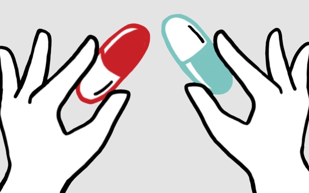
Well, for one, they haven’t always done so—especially if we trace the history of the pill, as Color Professor Jill Morton does. The ‘pill’ of “ancient Egypt… [was] a little round ball containing medicinal ingredients mixed with clay or bread.” Moving forward a bit to the 1940’s and 1950’s, Morton describes over-the-counter medications as having been “ghostly white or pasty pastel hues… prescription medications were colorless pills encased in clear or transparent orange vials.”
It was in the 1960’s, and particularly following the advent of the softgel capsule in 1975, that colored medications became commonplace. “Primary colors such as cherry red, lime green and tangy yellow” became the first of a rainbow of colors. Today, that rainbow includes up to 80,000 hues.
Differentiation and Meaning
While this historical background is useful, it doesn’t answer the relevant question: what’s the value of coloring pharmaceutical products? The first reason Morton identifies is differentiation. Medication is not the type of product that can be, generally speaking, mixed and matched. Coloration can mean the difference between taking a strong prescription medication and accidentally substituting it for an over-the-counter painkiller.
Some colors inform the patient of the pill’s intended results. “Calm blue for a good night’s sleep and dynamic red for speedy relief,” for example. Color can also factor into “synaesthetic effects” such as associating blue with coolness, or orange with warmth.
Morton’s musings on the subject are hardly outsider observations, either—as Colorcom’s head designer, she’s been involved in the creation of the highly successful “Tylenol Rapid Release Gel Capsules” and Lifescan’s “One Touch UltraMini Meter.”
Research Shows Color Preference
Colorcom, providers of “color consultation for Healthcare [and] pharmaceutical products,” utilizes a Global Color Database of over 200,000 people to provide “up-to-date information about consumer color preferences within any specific demographic groups that can be readily accessed.” Some of their findings are fascinating.
For one, they’ve identified differences between the way that colors “communicate” to men and women, and people of different generations—to such precision that Colorcom can “pinpoint the colors that are perceived to be powerful by American males ages 35-44” with insights from their database.
Color and Efficacy
In Munsell’s color blog, Morton expands on her discussion of medication color. She looks beyond manufacturer intent to the medication’s actual efficacy: “patients do indeed respond best when color corresponds with the intended results of the medication and not the symptom.” This is why the correct color of pill and/or tablet color matters for everything from anti-depressants to acid reflux.
In terms of continued use of a medication, Morton provides evidence that color consistency is critical. She cites a 2013 study that found that a change in pill color in anti-epileptic drugs. This change resulted in 53% of patients becoming “more likely to take a break from taking their drugs as prescribed.”
A change in pill’s color can reduce its efficacy even if taken normally—something Morton describes as the “opposite of the placebo effect.” The patient will end up with a belief that the newly colored pill, though identical in all other ways, will be less effective than the pill colored as they’re accustomed.
Culture Matters in Color Choices
Sunil Chiplunkar discusses cultural variance in attribution of meaning to color with some fascinating specifics. “White is the color of death in China but everywhere else it represents purity. Yellow is a sacred color in China but stands for sadness in Greece. Yellow and Red are very sacred colors among Hindu communities in India…” Chiplunkar explains that the only “universally non-controversial” color is gold.
Now, are each of these analyses perfectly accurate, and reliable in all cases? Is yellow always an indicator of sadness in Greek culture? Perhaps not, but Chiplunkar’s point is salient: “Color based on cultural conditioning can attract or sometimes repel… cultural conditioning matters.”
Accent Color and Whiteboard Video
Let’s think about how these revelations apply to whiteboard video, and the principle of the Accent Color. Often, people think first about Accent Color in terms of contrast, and rightfully so. This novel, stand-out element is a major part of the Accent Color’s focal power.
As scholars have shown, we should not simply choose a color arbitrarily. The hue itself is profoundly relevant.
Do you want to inspire feelings of excitement in your video, or instill a sense of calm? Commonly—extremely commonly, in fact—a client chooses the Accent Color that matches their company’s branded color, and this makes good sense. Their branding department chose this color to generate a feeling, and taking it into the video will do just that for viewers.
Just as pharmaceutical coloration follows a desire to set expectations, imply feelings and results, and create a consistent experience, the brand colors of a company—and the color they use as their Accent Color in a whiteboard video—are used for the same purposes. They also carry the same complications, needing to negotiate color meanings across demographics and cultures.
Colors don’t exist in a vacuum. Make sure you’re sending the message you want to send with your color selection. Even if they’re not immediately sure why, your audience will take your message the way you mean it that much more reliably and quickly.