Visual Storytelling: A Case Study

Telling a story visually can do remarkable things for your business and its messaging. It’s why TruScribe’s team of experts work so hard to hone their visual storytelling skills and incorporate them into each of our whiteboard videos.
So what makes visual storytelling so powerful for a brand?
Visual storytelling engages your brain, and you can take in more information, faster. Even beyond the science, the approach can be extremely useful. Let’s take a look at a successful use of visual storytelling as a case study, and examine why and how it works. Let’s look at Swatch.
Though it was most popular in the 1980’s and 1990’s, the Swiss watch brand Swatch has been a stylish and successful player in the timepiece industry since 1983. Their watches are traditionally flat and round-faced, with bands coming in various materials and colors.
What does their website want us to understand?
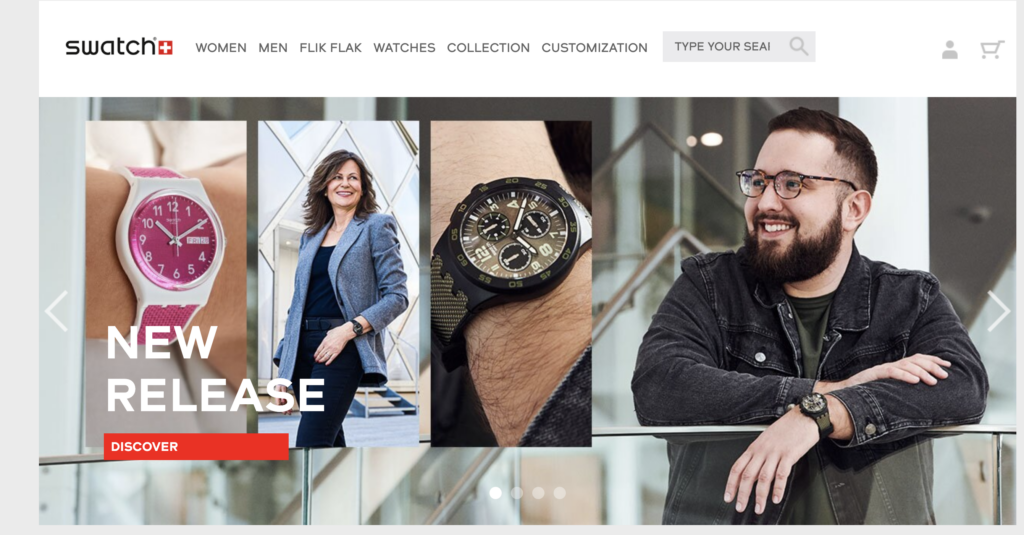
From the home page, we see that Swatch is telling us that it’s a cool product, and that it’s very organic. The photos skew heavily towards pictures of the people wearing the product, as opposed to the watch lying on a display shelf alone. These aren’t lifeless artifacts: they’re a part of their wearer, like their clothing and haircut.
Now note the use of color—red, in particular, evoking the red and white Swatch logo. Besides red, color abounds, with watches and backgrounds in teal, brown, yellow, pink, and green. Swatch is using these images to tell its website’s visitors that no matter their favorite color, Swatch has a watch for them—probably several, in fact.
Beyond the color and portraits, there’s a clear focus on using graphic boxes to direct visitors’ attention to Swatch’s many product lines and membership services. With each product portal containing images of a Swatch on a wrist, smiling Swatch owners, or standout Swatch designs.
What messages do the visuals send?
There are two messages sent by these product portal images. First, no matter who you are, there’s a Swatch that’ll look great on you. Second, wearing a Swatch is a fantastic way to find like-minded people.
Digging deeper into our case study, when we look at the page for Swatch’s kids’ products, Flik Flak, visual storytelling is even more of a factor. An even broader array of colors light up the page, as do pictures of children smiling together. There are personalized Swatches with the child’s name written on the band, and more youth-friendly imagery of animals and movie characters.
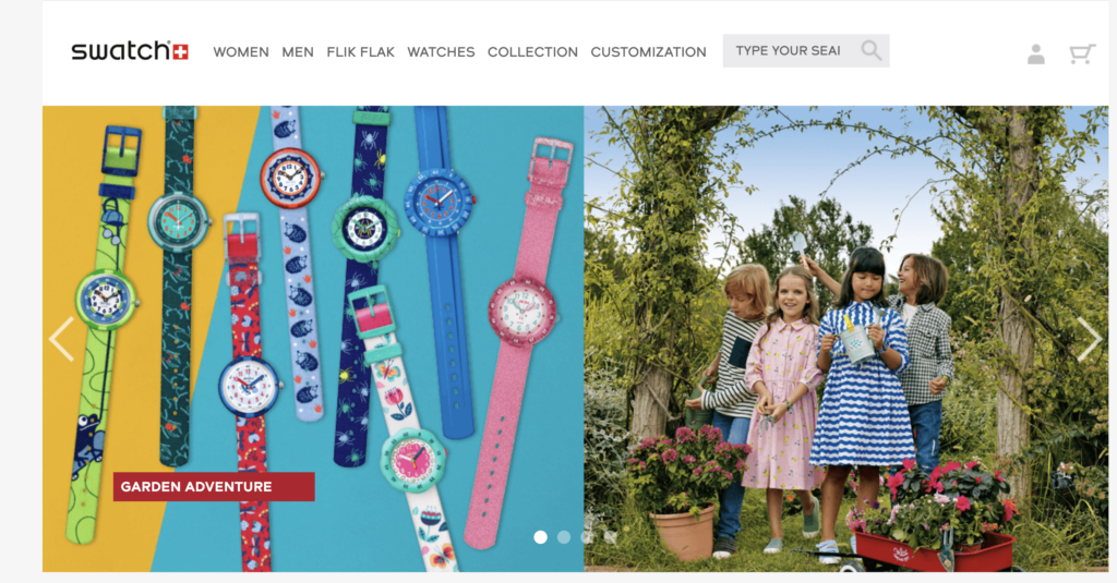
Swatch’s visual storytelling for its children’s product page is a targeted version of its home page. It’s been adjusted for children’s increased appreciation for color and fun with friends, animals, and popular entertainment.
The customization page uses visual storytelling to guide the viewer down the page as more design options and customization options are revealed. Color is still important, but the visual emphasis is now more concerned with text. As viewers scroll past the custom Swatch at the top, they see a “How Does It Work?” box that explains the make-your-own-Swatch process in three short sentences.
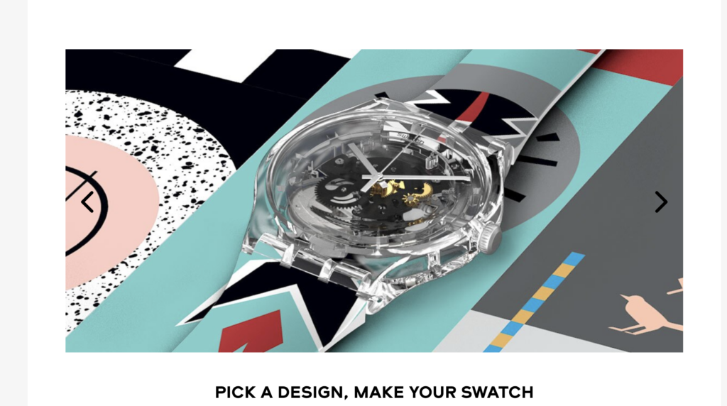
Designs only available for a limited time are displayed next to a large blue box that reads “Specials.” “From Japan to the World,” a promotion for Japanese Swatch artworks, is explained in a text box next to miniature renderings of the designs. The same is true for “Swatch x Louvre” and the “Ready to Wear” collection.
What does Swatch gain from this level of visual storytelling?
First, they gain speedy distribution of information. MIT has found that our brains process an image in 13 milliseconds. That’s why visual storytelling is such an “economical” information method, as Dominick Sorrentino puts it, and why it’s great for generating interest at the outset of a customer’s journey.
An audience is more likely to read nearby copy (marketing, sales, or otherwise) when visual storytelling is used. When Swatch has text for viewers to read, they position it right next to engaging and relevant artwork.
So visual storytelling is economical, stirs interest in copy, and can be processed 60,000 times faster than text.
How can you employ visual storytelling as well—or better—than our case study with Swatch?
Kanupriya Sindhu outlines several helpful ways to engage in visual storytelling.
- Have an objective. Use your visuals with purpose, not at random. Remember that Swatch’s use of the color red had multiple, specific functions (matching the logo, drawing the eye, etc.)
- Keep it clean. Don’t use overcrowded, busy images. On Swatch’s homepage, there are several pictures of a watch on an arm. The story: this watch makes this person look good. It doesn’t need fireworks and an ocean backdrop as well.
- Be meaningful. Use images that “communicate the most complicated emotions without uttering a word.”
How can you maximize your visual storytelling?
Jacinda Santora offers a few final suggestions on how to maximize your visual storytelling, especially after viewing a masterclass like Swatch’s website.
- Find out what motivates your audience. Some motivators the Harvard Business Review identified include wanting to “Feel a sense of belonging” and “Be the person I want to be.” Swatch’s visuals of smiling groups of people show the belonging you could feel as a Swatch owner. The many pictures of their various watches show that you can be the person you want to be with a Swatch.
- Pick the right high-impact visuals. Use images your audience will like. This may sound obvious, but it is crucial. Swatch puts images of animals on its children’s page because the company knows what a young audience likes to see.
- Choose the story that works best. A story needs a beginning, middle, and end, even if the internet can shake up this linearity somewhat. The homepage is the beginning, aiming to peak your interest with color and happy people. It gets you looking deeper into the website for the kind of Swatch that fits your style. Images of specific styles of Swatch guide viewers through the middle of the story. Pages where you zero in on your watch depending on criteria like age, customization, and current deals. Finally, the visuals direct you through the selection process and conclude on the checkout page.
At TruScribe, our dedicated visual storytellers combine years of experience to make our whiteboard videos engaging and effective. Remember Swatch’s case study and its ability to use visual storytelling to guide attention, attach to motivations, and tell a full, appropriate story with purposeful visuals.
Then ask yourself: are you using visual storytelling to its full potential?