What would it mean to tell a story without data? Immediately, we might think of a story that had nothing but emotions, or colors, or some other intangible concept that didn’t seem to merit the term ‘data.’ This definition, however, could use some expansion. Calling something “blue” is a point of data, isn’t it? If data is there to provide information about something, then isn’t knowing that someone is “sad” knowing some data about them?
Then again, when business writers extol the virtues of visual storytelling with data, they’re not talking about whether something is blue or someone is sad. They do mean the kind of data that most of us think of first: figures, numbers, changes over time, etc. Visualizing this kind of data, though, seems a tall order. Let’s look deeper into this question and uncover some of the best ways—and reasons—to employ visual storytelling with data.
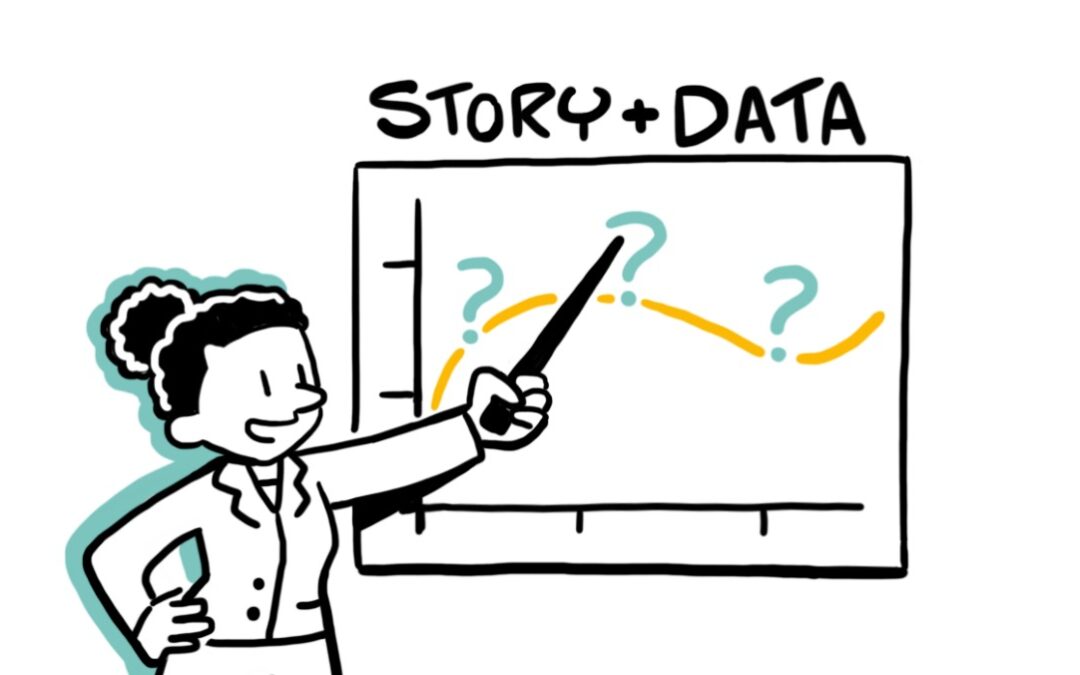
Data That Teaches
A straightforward starting point is Katy French’s acknowledgment that while all information (or “content” in her words) is data, the kind of data we’re hoping to express “provides more than knowledge; it provides insight. This insight helps decision-making and spur[s] action; therefore, it’s the most meaningful.”
This is why we’re right to think that “blue” counts as data, but does so in a different way than the figures a spreadsheet might show to investors. Knowing that a hat is blue doesn’t exactly give us a lot to work with. Knowing that revenue is up twenty percent last quarter gives an insight, which can lead to next steps and actions. We might, as stakeholders, inquire as to production changes, ask about any new training procedures, and look into recent marketing campaigns, all to discover if this trend can be maintained, and how we can best ensure it.
So, with this understanding of data, we can see the power of visual storytelling when the two are combined. Visual storytelling has a captivating effect on people, giving them information while engaging them with interesting, retention-securing visuals. The story (our human coding language, and something which all people naturally favor) also helps content remain relatable and trackable.
Telling A Variety of Stories
What kinds of visual stories can you tell with data? Ling Wong outlines five great examples: trends (like the revenue example mentioned above), comparison (measuring figures’ change over time), rank order (showing hierarchy to make a large amount of data easily comprehensible), statistical relationships (using correlations in data to predict which factors will impact each other), and counterintuitive data (surprising or attention-grabbing data that drives further engagement).
We know for a fact that surprise, the key element of the counterintuitive data presentation, creates a dopamine release that drives engagement. It does so by generating and maintaining curiosity. How do these other examples have a similar effect on viewers?
Keep the Structure, Add the Data
Wong points out that visual storytelling with data isn’t structurally dissimilar from visual storytelling overall—it also follows a path that includes a plot, setting, characters, and an ending. Of course, in data-driven storytelling, these elements take on different forms. The plot “involves the questions you’re addressing, how you plan to answer them and how you’re going to help the audience arrive at the conclusion,” rather than being a bit more of a character-driven arc with a frequently unrevealed ending.
The setting “is the context that will impact how your audience interprets the data,” less a physical location or time and more frequently “benchmarks” that will provide comparative points for your data. The characters are more nebulous than in non-data visual storytelling, which tends to have named characters infused with values and goals. The data-driven visual story is more adaptable to its audience. It describes its ‘characters’ more in an interest to “address the audience’s priorities and explain how the insights can help them achieve their goals” (italics mine), instead of the goals of the fictional protagonist.
The end in data-driven-storytelling, however, is quite similar to ‘normal’ visual storytelling. It involves a “summary of what the audience has learned from the data story, how they can achieve results or what they should do differently in the future to improve outcomes.” A data-driven story about the collapse of a once-successful, major corporation might share a lot in its final ideas with a classic tragedy, warning the audience against hubris, callousness, or excessive greed.
Empathy and Simplicity
This gets at the surprising truth about data-driven storytelling: despite the different type of information it focuses on, and the distinction we might instinctively draw between the data-driven and the non-data-driven story, as Admond Lee puts it, the two most crucial elements of data-driven storytelling are just like those of its cousin. “To communicate effectively with data—empathy—and the very core and fundamentals of data visualization—simplicity,” are the bedrock of telling a visual story with data.
Data-driven storytelling is hugely effective. To return to Wong’s analysis, it can “anchor your claims and increase the credibility of your content.” It will “help you stand out and capture attention,” especially when the figures you’re showing are proprietary and not widely known. And its “combination of narrative and visual elements activate both sides of the brain, delivering an experience that’s analytical and emotional at the same time to help your audience cement the information.”
Embracing Data in Visual Storytelling
Why do we feel odd (if we do, that is) about approaching visual storytelling from a data-driven perspective? Well, simply put, few of our favorite films and novels have graphs. Not many feature spreadsheets, and there simply isn’t an abundance of numbers in them.
But numbers, and all of the above, provide insights in the same way that ‘normal’ visual storytelling does. It just requires a dedication to strong visual storytelling principles and the hard work to craft a successful narrative to encapsulate that data. Done well, data-driven storytelling can drive organizational transformation, excite internal and external viewers, and create a fuller understanding of a business’ role in its own development—and the development of the world around it.