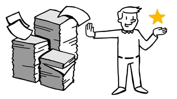
While it might seem that there’s no such thing as too much information, the truth is that restraint is frequently more valuable (and requires more effort) than total inclusion. We can likely all agree that we’d rather a carefully written page of information than a wandering fifty page dissertation on the same subject.
To quote Mark Twain (though the sentiment has been attributed to several sources, including Abraham Lincoln), “I apologize for such a long letter – I didn’t have time to write a short one.” At TruScribe, we don’t write letters or dissertations, but we value the sentiment just the same: our best work is often our simplest and most concise. Particularly as audiences watch more video content than ever before, we want your message to come across straightforwardly and directly.
This means that our artists spend considerable amounts of time and work to determine just what imagery will complement and reinforce your forced message—and just as much time making sure that nothing else is included. Let’s take an example to flesh this point out: the office trash can.
Almost every office has a trash can, and numerous other standard equipment. Crucially, though, our artists rarely draw these in office settings, or concern themselves with including every material that would normally be found in an office. This might seem at first to be counterintuitive—why not include everything that could potentially secure the audience’s understanding of the space as an office?
Simply put, because the audience doesn’t need it. We understand and respect the brain’s ability to extrapolate settings and more without a full, photo-realistic depiction of the environment. Viewers don’t need to see each and every element of a location, building exterior, or other visual.
To take the point to an extreme, a character wearing a work vest and hardhat doesn’t need to be holding up his employment paperwork for viewers to understand that he’s employed at a construction site. Importantly, though, the ability of the viewer to fill in whatever blanks are left by the omission of such details is not the only reason we do not draw “everything.”
The best reason that we use simple, evocative imagery instead of dedicating ourselves to total realism is that our images our created to adhere directly to your script. That means that if your script has a phrase like “attend meetings easily without leaving your office,” you’re right expect to see someone conducting a meeting in their office, and the drawings necessary to convey this.
This example might lead to a visual of a character in her office in front of a computer screen, representing “your office” and showing the person “attend[ing] meetings.” This one-to-one relationship between voiced script and drawn imagery is complete with these visuals. To add more—the trash can, a printer, an office plant, a series of desk photographs, a coat rack—is not only unnecessary, it’s distracting.
The importance of that one-to-one relationship cannot be overstated, as the above-mentioned coat rack will not just distract in some vague sense—it will specifically pull engagement away from your voiced message. In other words, we’re not limiting your message’s power by drawing only what’s necessary, but in fact maintaining its ability to engage and stay with your viewers.
This pertains to our production style generally—we follow the science of retention and engagement that shows that simplicity and ease of comprehension are dramatically more effective than extremely image-dense frames and ornamented, dazzling drawings.
We use your accent color to point to the crucial elements of the frame, and signify which visuals should pop out the most. We don’t splash multiple colors into your frame, removing any one color’s ability to be significant or focus your viewers’ attention.
We use icons and simple designs so that their meanings are universally, and quickly, understood. We don’t tie up your viewers’ attention in complex visuals that only make sense if your viewers already understand the ideas at play.
We involve you in your voiceover selection and recording session, so that you can be sure that your voiced message is clearly articulated and appropriately delivered. We don’t choose a voiceover for you, and we don’t encourage stylized, unnatural, or otherwise distracting delivery.
We synchronize your voiceover and drawings to ensure that the artist draws your visuals at the perfect time to complement the script segment it’s reinforcing. We don’t simply show a panel of drawings and play your narration over it, as we know the brain prioritizes visual information and will likely ignore your voiceover (or struggle to retain it) when the two elements are out of sequence.
In short, the power of whiteboard video comes in large part from its focus. At TruScribe, we maximize this focus with precisely the right images, and no filler imagery that will only serve to distract. We maintain your audience’s engagement with a single accent color, and no others. And we bring the same approach to your voiceover and the synchronization of that voiceover with your hand-drawn visuals. Does your organization value efficient, to-the-point design? Do you think that your viewers need to see more—or less—in your video initiatives? What about Mark Twain—do you think he was right that it’s harder to be concise than verbose?