There aren’t many elements of your whiteboard video that people notice as much as your human characters. That’s partially because the human brain is wired to seek out and focus on human forms, and it’s also because characters are usually the ‘active’ part of the frame (even in whiteboard video, where the drawings are not ‘moving’ of their own accord). So, how should your characters look?
Why Do Your Characters Matter?
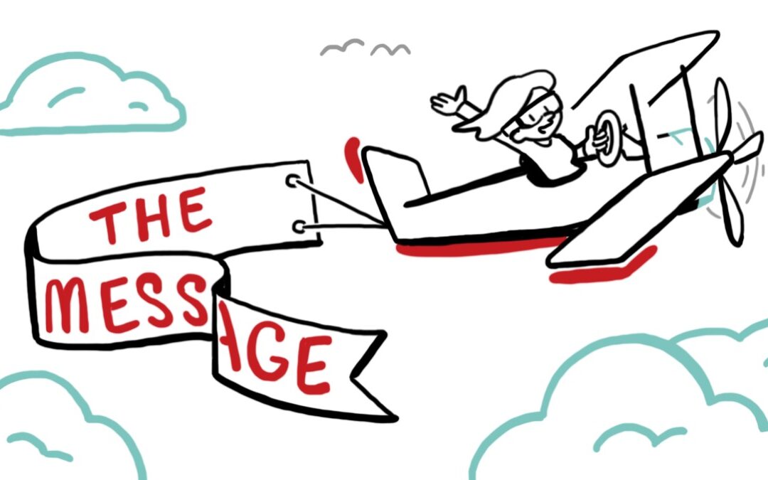
Before we get into some examples of looks that you might choose, a fundamental concept deserves to be underscored: your characters exist to serve your message. They’re part of a story, and that story exists to streamline communication and clarify your takeaway for your viewer. So, what does this have to do with their look?
It means that characters should a) fit the tone of your message and b) avoid distracting the viewer from that message. You’re usually going to want to avoid excess—extreme, overwhelming imagery is going to take up a viewer’s full focus. Since the brain will always prioritize the visual over the auditory in terms of information absorption, your audience’s retention rates will take a major hit as they tune out your voiced script in favor of the fascinating visuals.
With this core concept in mind, what kinds of character styles are out there, and which are most appropriate for your message?
The Realistic Route
First up is the realistic character. As the name implies, this style of design aims to create the most true-to-life depiction of a character as possible. It tends to evoke feelings of sincerity, seriousness, and a general grounding of the character. Of course, realistic is a relative descriptor here—it’s more a statement of intent than an earnest attempt to create photorealism. Realistic characters are drawn with attention to ratios and size of the body, and avoid cartoonish exaggerations.
As you might expect, this kind of character excels in more serious topics, where more fanciful designs might conflict with the subject matter. When discussing first responders to a natural disaster, for example, a realistic design choice can help to maintain the gravity of the situation.
There’s something about the retention rates possible with realistic characters that deserves mention. Realistic characters tend to have a lesser chance at distracting the audience, since they look the most like the people we see every day. For serious topics, this can be especially useful, as concepts that evoke difficult emotions can cause viewers to want to focus on something else, and realistic characters will help your message stay front and center in their minds.
One possible downside to highly realistic characters, however, is that they can be a bit… boring. If your message is about the wild, wacky joys of a kid’s funhouse, the rigid realism of these characters might make them boring compared to their settings. And if your audience is made up of children, these characters might not distract them—but they certainly won’t excite them.
Clean and Flexible
The next character design is the sort of neutral, clean, flexible presentation that TruScribe uses. Without major exaggerations of features but similarly without a hardline dedication to total realism, this kind of design evokes whimsy while remaining versatile.
It functions in a large plurality of contexts, working both to fit and balance heavier messaging and to increase lightheartedness in upbeat messaging. It works in technical scripts and for abstract ideas, allowing audiences to see the familiar human forms that drive their engagement and keep the topic relatable, while being non-intrusive enough to keep the voiced message at the top of their minds.
Modular designs like these clean, flexible ones can also be made to be more expressive, more centralized, and maintain the audience’s focus more than they might in other scripts. For instance, if your video is a celebration of your CEO’s role in the company’s creation, this type of design is well-suited to being expanded enough to fit the part.
Caricature
On the other side of the character design spectrum is the caricature (sometimes called the ‘extreme’ caricature). This character type is almost entirely stylized, with certain features exaggerated wildly, or profoundly minimized. The emphasized traits are the ones meant to draw the eye and focus engagement, while the minimized or near-normal traits are there mainly to maintain recognition (we have to know what we’re looking at, after all).
Extremely caricatured characters work best for lighthearted and comedic topics, where their exaggerated features can be played for silliness and fun. If you’re opening an arcade or selling water balloons, extreme caricatures might be your go-to.
On the other hand, if your video is serious, using this type of character can be very, very ill-advised. If you are discussing real hardships, matters of life and death, or really any topic in which maintaining your credibility as a storyteller and finder of solutions is foregrounded, avoid extreme caricatures. They broadcast a consistent message of “Don’t take this too seriously” that will undercut your video’s effectiveness immediately.
Your Message, Your Characters
As you may have guessed, there’s no hard and fast rule to be found regarding which type of character to use. Almost always, the project determines the most appropriate type.
That being said, flexible, modular characters function almost all of the time. Whiteboard videos with topics from highly sensitive to loose and fun can utilize these characters with equal efficacy, and this is why TruScribe maintains these designs as our house style for each of our projects.