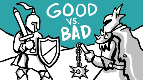
There are a lot of ways that whiteboard animation can truly supercharge your audience’s engagement and retention—but there are also a lot of ways that it can miss the mark. Instead of exploring these positives and negatives through purely theoretical discussion, let’s use the following script segment to show the results of best (and less successful) practices in whiteboard. Without further ado, our short script:
“At Cinema Magnifique, we entertain audiences the world over. Our international film programming has been celebrated for over 25 years, and we’re excited to see where the future takes us. As we enter the New Year, Cinema Magnifique is proud to announce our newest event: Film Noir Fridays.
“Every Friday, bring the family for a trip back in time to the era of hardboiled detectives, crime, and intrigue. Get ready to teach your children what a rotary phone looks like! And for the first Friday of every month, get ready for Double Feature Fridays! We can’t wait to see you in our seats at Cinema Magnifique.”
Let’s first take a look at how these two paragraphs might look in a poorly rendered whiteboard video.
Options for Artists to Choose from in making the Bad Version of this video:
- Two (or more) accent colors
- Highly complex, ornamented, opposite-of-simple design/drawings
- Imagery that is unrelated to the script; perhaps inserts or even drawn charts that make sense to the client but don’t match the script
- Far too many images, crowding the frame and making the human hand move incredibly fast (especially if contrasted between the two paragraphs; maybe the first paragraph is normal paced and the second is hyperspeed)
Explanations for Why These Approaches Make for a Poor Video
- When you use more than a single accent color, you dilute the power of the accent color. The reason for using an accent color is to denote importance and guide the eye to the most significant part of the frame. Using multiple accent colors runs counter to this purpose, as now there are several indicators of what’s most important—and if everything is most important, nothing is. Accent color can also be used as a thematic tool, signifying your brand or other element; this will also be impossible with multiple accent colors. Think of it as a lifeline, pulling your viewers toward the shore (your message); now imagine how ineffective dozens of lifelines pulling in opposing directions would be, and you’ve got a good idea why the best videos use only one.
- Simple, easily-understood imagery is king, for several reasons. First and foremost, it’s quickly digestible, and does not require any specialized knowledge for comprehension. Secondly, its opposite—highly ornamented, complex, arresting imagery—is destructive to your video’s ability to engage viewers. More accurately, it’ll damage their engagement (and retention of) your message; they might be engaged with the visuals, but that will likely be the extent of their engagement. Ornamented imagery holds the eye and attention, but we know that the mind prefers visual information to auditory information—meaning that every second spent marveling over a visual design is a second spent ignoring your voiced script.
- Imagery should always correspond directly to your voiced script. While you might want to use a certain visual to depict an idea, if your script makes no mention of that visual, the disconnect will be difficult for your viewers to navigate. The result will almost certainly have an impact on retention of your message. Think of listening to a podcast while reading—would you expect to able to retain the message of both? Your viewer’s engagement will be similarly divided, making recalling your message much harder than it would be if your visuals and voiced script were directly related.
- While it’s reasonable to expect that more imagery leads to higher engagement, too much imagery can actually hinder message retention and create severe pacing issues. If your whiteboard video has frames that are absolutely crowded with imagery, the human hand drawing those images will have to move extremely fast to maintain the synchronization between visuals and narration that whiteboard uses to heighten engagement and retention. Since the voiceover will proceed at a normal pace, the editor will need to accelerate the hand’s movement to achieve that sync to the point of overwhelming and frenetic movement. This will distract from your spoken message, as the motion and visual information will dominate the viewer’s attention, and they will likely retain a memory of “that frame with all those [types of images]” instead of “that scene where [topic] was explaned.” Finally, this issue is problematic if it happens once or throughout your video. A single scene with overly dense imagery will seem out-of-place compared to the rest of your video, and a full video of this kind of high-speed density will suffer continuously from lower retention.
Now, let’s contrast these problematic approaches with a well-designed and constructed video.
As we see in this example, the use of a single accent color allows the artist to focus the eye of the viewer on the exact part of the frame that is most important and relative to the voiced script. There’s no question that this color represents the key elements of Cinema Magnifique’s message, as it has no competition from other colors in any frame. This is principled, purposeful use of an accent color in action.
The imagery used is simple and straightforward, attractive and comprehensible. The desired effect of the imagery is not to dazzle for its own sake, but to support the message of the script. This means that the images engage without distracting, keeping the viewer curious and interested through the motion of the hand drawing them and the judicious use of the accent color.
Beyond being simple designs, the visuals are also directly related to the voiced script. There are no extraneous, unrelated images being drawn while the script discusses something entirely different. Instead, each image represents the concepts covered by the narrator, and is synchronized to ensure this 1-to-1 relationship. This relationship not only keeps engagement consistently high—it greatly increases your viewer’s ability to retain your message. When visuals support the spoken message, the viewer will remember both that visual and the corresponding script section with ease.
Finally, each frame has just the right amount of imagery. Careful attention to image density (particularly when the images themselves correspond directly to the script and are designed simply) maintains the high engagement and retention boosts for which whiteboard video is celebrated. Since the image density is controlled instead of overwhelming, the attention of the viewer stays on the message that those images support. The crucial synchronization of audio and visual is accomplished without having to speed up the human hand’s movement to the point of distraction, and the pacing of the video is consistent from frame to frame.
There are more design principles that contribute to a great whiteboard video, and more risks that can endanger one’s ability to engage your audiences and help them retain your message. Have you seen some of these missteps in online videos? What sorts of content creation decisions can you think of that could help you make a great video?