Introduction
Most animated product videos don't fail because of poor production. They fail because of avoidable structural mistakes made long before any drawing begins — a script built around features instead of problems, a visual style chosen for aesthetic appeal rather than audience fit, or a runtime that outlasts viewer patience.
The stakes are real. Vidyard's benchmark report across 943,305 B2B videos found that 65% of viewers finish videos under one minute, compared to just 20% for videos over 20 minutes. That gap comes down to design decisions, not viewer attention spans.
This guide covers what those decisions look like in practice: script discipline, visual and pacing choices, animation style selection, buyer journey alignment, and the structural mistakes that undermine otherwise well-produced work.
Key Takeaways
- Anchor every animated product video in one specific viewer problem — not your product, your brand, or your feature list
- Complete the script before animation begins — every production decision downstream depends on it
- Match animation style to communication goal, not to trends or competitor aesthetics
- Keep awareness-stage videos under 60-90 seconds; decision-stage videos earn longer runtimes by answering concrete buyer questions
- Define success metrics before production starts — not after launch
Why Animated Product Videos Consistently Outperform Other Formats
Animation removes a core constraint of live-action: the camera can only capture what physically exists. For B2B and technology products — cloud infrastructure, pharmaceutical mechanisms, enterprise software workflows, financial instruments — the value proposition is often invisible. Animation can build it from scratch.
The cognitive case is well-established. Richard Mayer's research on multimedia learning found that words plus pictures outperformed words alone in 11 consecutive comparisons, with a median effect size of 1.39. Animation with narration beat animation with on-screen text in 12 of 12 comparisons. Removing irrelevant visuals improved comprehension in every test.
That advantage stems from how the brain processes information. Verbal and visual content travel through separate cognitive channels, so synchronized narration and visuals use both without overwhelming either — which is why animation is especially effective for products that require explanation before purchase.
What the Research Actually Supports
A few important distinctions worth knowing before you commission anything:
- Animation aids comprehension and retention — it doesn't automatically guarantee conversion
- The learning advantages are strongest for abstract, sequential, and process-driven concepts
- Visual clutter actively harms comprehension — decorative animation competes with the message
The format works best when the communication problem genuinely requires it — explaining a drug mechanism, mapping an enterprise workflow, or making an abstract value proposition visible for the first time.
Core Best Practices: Script, Story, and Message Clarity
The script is the load-bearing structure. When production begins before the script is finalized, every visual decision is built on an unstable foundation.
At TruScribe, script development is the first phase — drawings, voiceover, and editing don't begin until the script is in hand. Every visual element must serve a defined message, and without the script, there's nothing to serve.
Start With One Problem, Not Your Product
The most effective animated product videos open with a specific, recognizable pain point — not a brand introduction, not a product name. Viewers engage when they recognize themselves in the scenario. A viewer who sees their own frustration reflected in the first ten seconds will keep watching to find out what happens next.
Demand Gen Report's 2023 B2B content survey found that 54% of buyers felt overwhelmed by available content, and 51% said content was too sales-oriented. Leading with the buyer's problem and desired outcome — before touching features at all — is what separates videos that convert from ones that get skipped.
Enforce the Single-Message Rule
The impulse to cover every feature is understandable and almost always counterproductive. High-performing animated product videos are built around one core transformation the viewer will experience. Every other piece of content in the video supports that single message or gets cut.
Write to the Ear
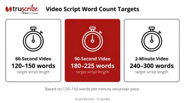
Animation scripts are spoken, not read. That distinction changes everything about sentence construction. Short sentences. Active voice. Natural rhythm. At a comfortable voiceover pace of 120-150 words per minute, plan for:
- 60-second video: 120-150 words
- 90-second video: 180-225 words
- 2-minute video: 240-300 words
Read the script aloud before approving it. If it sounds like a brochure, rewrite it to sound like a person talking.
Close With One CTA
The call-to-action should follow naturally from the narrative arc — not feel bolted on. Give viewers one specific next step, not a menu of options. Ambiguity at the end of a video kills the momentum the rest of the video built.
That same discipline around focus applies to length.
Keep It Short by Design
For awareness-stage content, under 90 seconds is a reliable target. Decision-stage content can extend to 3-5 minutes when it's answering concrete buyer questions — Wistia's data found 74% average engagement for 3-5 minute instructional videos versus 43% for all videos of that length. The key word is instructional: every additional minute has to earn its place.
Core Best Practices: Visuals, Pacing, and Animation Style
Use Visuals to Carry Meaning — Not Decorate
Every visual element — character, icon, transition, graphic — should earn its place by advancing viewer understanding. Visual clutter doesn't just look busy; it actively competes with the message. Mayer's research found that removing irrelevant media improved comprehension in 6 of 6 comparisons, with a median effect size of 1.66. Animation that exists purely for visual interest extracts that cost from your viewer's comprehension.
Match Pacing to Concept Complexity
Scene duration and motion speed signal to viewers how complex an idea is. What feels "too slow" during editing often translates to better comprehension during viewing. Change a scene when the idea changes — not on a timer. Keep narration and visuals temporally aligned. A visual that appears before or after its corresponding narration creates a cognitive gap that reduces understanding.
Align Style to Brand and Audience Trust
Animation style sends an immediate credibility signal before the viewer processes a single word. A mismatch between style and audience expectations creates friction that works against the message.
| Style Choice | Strong Use Case | Risk |
|---|---|---|
| Whiteboard/sequential reveal | Complex B2B, process explanation, abstract concepts | May feel informal for some audiences if not executed well |
| 2D motion graphics | Software interfaces, data flows, abstract workflows | Can overwhelm if pacing is too fast |
| 3D animation | Physical products, mechanical systems, spatial relationships | Higher production cost; less effective for abstract ideas |
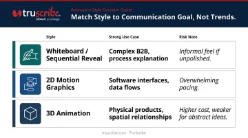
Choose style based on what your audience needs to understand and trust — not what looks impressive in a style reel.
The Sequential Reveal Advantage for Complex Products
Whiteboard-style animation, where visuals are revealed progressively as narration unfolds, has direct cognitive backing. A 2022 randomized study with 299 participants found whiteboard animation produced higher comprehension than narrated slides or lectures (mean 6.41 vs. 5.20, effect size .22).
The mechanism is attention direction. When a full visual appears at once, viewers must independently decide where to look — a cognitively expensive process. Sequential drawing eliminates that competition by guiding the eye precisely where it needs to be at each moment.
TruScribe's Scribology methodology is built around this principle. Sequential hand-drawn reveals, minimalist design, and calibrated pacing work together to reduce cognitive load while building understanding layer by layer. Across 5,000+ projects with clients including Siemens, Medtronic, HPE, and Fidelity, this approach has proven particularly effective when products are technically complex and comprehension is mission-critical.
Design for Sound-Off Viewing
A meaningful share of video views across digital platforms happen without audio — particularly on LinkedIn and social feeds. Best-practice animated product videos ensure the core message can be understood through visuals and on-screen text alone. Captions and ADA-compliant subtitles are part of the video's distribution strategy, not an afterthought.
Structuring Your Animated Product Video for the Buyer's Journey
An awareness-stage video and a decision-stage video are different products. Using the same script and length for both wastes budget and loses buyers at the moment they're closest to converting.
Awareness vs. Decision: Different Jobs, Different Designs
| Stage | Primary Goal | Script Focus | Length |
|---|---|---|---|
| Awareness | Emotional resonance, problem recognition | Name the problem, promise an outcome | Under 90 seconds |
| Consideration | Mechanism understanding, differentiation | How it works, why it's different | 1-3 minutes |
| Decision | Proof, specificity, one next step | Outcomes, evidence, CTA | 3-5 minutes for instructional content |
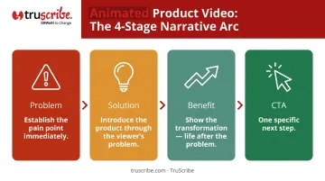
The Problem → Solution → Benefit → CTA Arc
This four-part structure mirrors the buyer's mental journey through a video:
- Problem — Establish the pain point immediately. Viewers decide whether to keep watching within seconds
- Solution — Introduce the product as the answer, but through the lens of the viewer's problem — not a feature list
- Benefit — Show the transformation. What does life look like after the problem is solved?
- CTA — One specific next step that follows naturally from everything that came before
Build Credibility Into the Middle
Most companies misplace their evidence — either front-loading it before the viewer is engaged, or burying it at the end where it's easy to skip. Place each type of proof where it does the most work:
- Use-case specifics — in the solution section, to show the product fits the viewer's exact situation
- Outcome data — in the benefit section, to quantify the transformation before the CTA
- Social proof — in the solution-to-benefit transition, where skepticism peaks and credibility matters most
This sequencing is where many B2B videos either over-explain or omit the evidence that actually drives decisions.
Tailor Placement to the Channel
Once the structure is solid, distribution decisions follow directly from it. The same core video should be cut differently depending on where it lives:
- Homepage: Prioritize play rate and hook strength — viewers are browsing, not committed
- LinkedIn: Add captions — most viewers watch without sound; hook in the first 3 seconds; shorter performs better
- Product demo page: Viewers are already interested — longer, more detailed content is appropriate
- Sales deck: Serves a specific objection or proof point in context; often a 60-90 second focused cut
Wistia's analysis of 13 million videos found a 24% homepage play rate — meaning roughly three-quarters of homepage visitors don't press play. That number alone explains why a homepage cut and a demo-page cut need to be built with entirely different assumptions about viewer intent.
Common Mistakes That Undermine Animated Product Videos
Feature-Dumping Instead of Value-Framing
The most common failure: a video that walks through product features sequentially without ever connecting them to a viewer outcome. The result is technically accurate and completely unmemorable. Features describe the product; benefits describe what changes for the viewer. The script needs to stay in the second category.
Style Choices Driven by Trend Rather Than Audience Fit
Teams frequently choose animation styles based on what looks impressive internally or what a competitor recently launched. Neither is a valid selection criterion. Style should be chosen based on:
- The nature of the concept (physical vs. abstract)
- The audience's trust signals and expectations
- The communication goal (demonstrate mechanics, build understanding, or drive emotional engagement)
A playful cartoon aesthetic for a regulatory compliance product creates cognitive dissonance that undermines the message before the content is even processed.
Treating the Script as Secondary to Visuals
Script-first is not a preference — it's a production requirement. When animation begins before the script is finalized and approved, the visual work has to be rebuilt or compromised when the script changes. Every element of a TruScribe video is designed to serve the script's message; without a finalized script, purposeful visual design is impossible.
Frequently Asked Questions
How long should an animated product video be?
For awareness content, aim for under 90 seconds. For decision-stage content, 3-5 minutes works well when the video answers specific buyer questions. Completion rates drop sharply as runtime increases, so every extra minute needs to earn its place.
What makes an animated product video different from a regular explainer video?
An explainer video addresses how and why a solution works — often at the category or concept level. A product video focuses specifically on a product's features, benefits, and use cases. The distinction matters because it changes script focus and visual specificity, not just the label.
How do I choose the right animation style for my product?
Match style to the communication challenge. 3D animation works for physical product mechanics. Motion graphics suit data and process flows. Sequential whiteboard-style animation is most effective when viewers need to build a new mental model first — the sequential reveal guides attention and builds understanding step by step before the value lands.
Can animated product videos work for complex B2B products?
Animation is well-suited for complex B2B products because it visualizes abstract processes and builds understanding sequentially — something live-action and slide decks cannot do. Organizations in enterprise software, healthcare, financial services, and industrial manufacturing use it to turn dense subject matter into something audiences can actually follow.
What's the biggest mistake companies make with animated product videos?
Feature-dumping — trying to cover too much in one video without connecting any of it to a viewer outcome. The highest-performing videos are built around one core transformation or problem solved, with everything else saved for a follow-up video.
How do I measure whether my animated product video is actually working?
Track completion rate, click-through rate on the CTA, and conversion rate on pages where the video is embedded. For social distribution, add engagement data. Define these metrics before production starts — the video should be built with measurable goals in mind, not evaluated after the fact.