Introduction
Whiteboard animation has earned its place as one of the most trusted formats in B2B communication — not because it looks distinctive, but because it works. Organizations from global nonprofits to Fortune 500 companies use it to train employees, explain complex products, and drive measurable audience action.
But not all whiteboard videos are created equal. The ones that actually move audiences share specific structural and creative traits that separate them from forgettable content.
The 15 examples ahead span corporate training, brand storytelling, product explainers, healthcare, and B2B communications. Each one illustrates a specific technique you can apply directly to your next video — from compliance training and product launches to change management campaigns and beyond.
Key Takeaways
- Whiteboard animation holds attention by revealing visuals progressively, activating both visual and language processing simultaneously
- The highest-performing whiteboard videos lead with a clear problem and close with a specific call to action
- Watch-through rate depends on pacing, not video length
- The format works for training, marketing, healthcare education, and internal communications
- Real examples are the fastest way to identify what structure and style fits your audience
What Makes a Whiteboard Animation Video Truly Effective
The Science Behind the Format
The progressive reveal of hand-drawn visuals isn't just aesthetically interesting — it's cognitively strategic. A 2023 experiment with 133 students found that progressively drawn whiteboard visuals improved retention and transfer over static presentation, with medium-to-large reported effects. A separate 2016 study of 621 adults comparing whiteboard animation against narrated slides, audio-only, and text-only instruction found advantages for retention, engagement, and enjoyment.
The mechanism comes from Richard Mayer's Cognitive Theory of Multimedia Learning: learners process verbal and pictorial information through separate, limited-capacity channels. When narration and drawing are synchronized, the brain integrates both streams — deepening understanding without overloading working memory.
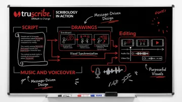
TruScribe's proprietary Scribology method is built directly on these principles, using sequential drawing, minimalist design, and hand-drawn visuals to direct attention, reduce cognitive overload, and activate deeper memory pathways. Together, these elements produce what TruScribe measures as 2.3x higher retention than traditional video.
Three Pillars of an Effective Whiteboard Video
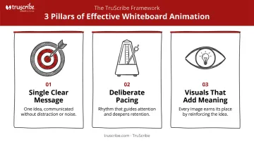
That science translates into craft. Every example in this list succeeds because of these three structural factors:
- A single, clear message — The script is built around one core idea, not five competing points
- Deliberate pacing — Each concept gets breathing room before the next is introduced
- Visuals that add meaning — The drawings reinforce or extend the narration, never just illustrating it word-for-word
What commonly goes wrong: information overload, visuals that compete with the voiceover, and weak or absent calls to action. Watch for those patterns — and their absence — in the examples ahead.
15 Eye-Catching Whiteboard Animation Examples
These examples were selected to represent a range of industries, goals, and animation styles — so regardless of your sector, there's a relevant model here.
Corporate Training & Learning and Development
Example 1 — Workforce Singapore: Leadership and People Management
This video breaks down what separates effective managers from ineffective ones for a corporate L&D audience. What makes it stand out is its two-color visual theme and a "dimming spotlight" technique that draws attention to one idea at a time. Rather than presenting a dense management framework all at once, the video uses visual hierarchy to guide the viewer through each concept sequentially. It's a direct, replicable lesson in how color restraint and visual focus serve learning objectives better than visual complexity.
Example 2 — Communications Training (Dana Brownlee)
At over seven minutes, this video on diagnosing and fixing common team communication breakdowns could easily lose viewers. It doesn't. The public video holds attention through colorful, dynamic whiteboard visuals that shift with each new concept, proving that runtime is not inherently a liability. Pacing and visual variety matter far more than length. If your content genuinely requires eight minutes, better visual design is the answer — not compression.
Example 3 — Harvard Negotiators ("Getting to Yes")
This video makes academic negotiation theory accessible to a general business audience. What's worth borrowing: scenario-based examples that illustrate abstract principles. Instead of defining "principled negotiation" conceptually, the video walks viewers through relatable situations. Theory becomes something they can immediately picture applying — a direct model for any L&D team translating research into training content.
Brand Storytelling & Marketing
Example 4 — Coca-Cola Content 2020
Coca-Cola used whiteboard animation to share its own content marketing philosophy — a bold choice that positioned the brand as a thought leader rather than just an advertiser. Executive narration combined with sketch visuals carries authority and warmth in equal measure. The executive voice provides credibility; the hand-drawn visuals keep the ideas feeling accessible rather than corporate. Any brand storytelling brief can borrow this combination.
Example 5 — Red Bull Whiteboard Series
These short, humor-driven animations demonstrate that simplicity plus personality is a more memorable combination than polished production. Basic character designs and consistent wit produce a distinctive brand voice. Don't mistake visual complexity for quality. A clear point of view, delivered consistently, creates stronger brand recall than elaborate animation.
Example 6 — The Story of Stuff
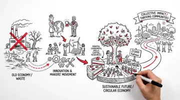
Annie Leonard's long-form video became one of the most-shared hand-drawn videos on the internet by translating a complex environmental argument into a simple, linear visual story. The secret is its narrative arc: a clear villain, a clear problem, and a clear call to action. Dense subject matter becomes compelling when the structure is this disciplined. For content marketers tackling systemic or complex topics, this is the gold standard for narrative architecture.
Product & Sales Explainers
Example 7 — Adobe EchoSign
This video explains a cloud e-signature product to a non-technical buyer. The design craft that makes it work: fluid object transformations where one drawn element morphs into the next. Viewer attention stays locked during a product walkthrough that could otherwise feel clinical.
If your product demo relies on showing process transitions — a workflow, a handoff, a conversion — this morphing technique keeps the story moving without cuts.
Example 8 — PadMapper
This 1-minute 40-second video introduced a rental-search app to the market with humor and clarity, accumulating over 310,000 views. The structure is textbook pain-point-to-solution: apartment hunting is miserable, and here's relief. The video earns viewer goodwill by validating a real frustration before offering the product. This sequence — problem empathy, then solution — is directly replicable in any product launch video.
Example 9 — Intelichek: Competitive Market Intelligence
This video helps automotive businesses understand local competitor pricing. Its most instructive quality is what it leaves out. The animation delivers a full value proposition and product walkthrough in under two minutes by stripping every visual element that doesn't directly support the message. For B2B product explainers where the audience is busy and skeptical, that discipline — cutting anything that doesn't earn its place — is what makes the video work.
Healthcare, Science & Social Impact
Example 10 — Health Mart (McKesson)
This pharmacy-sector whiteboard video uses purposeful color accents against a primarily black-and-white palette to draw the eye to critical data points and differentiators. In regulated industries, clarity and trust matter more than visual flair. This restrained approach — color as signal, not decoration — is especially valuable for healthcare, financial services, and compliance communications where viewers need to process specific information accurately.
Example 11 — Oxfam: Raising Her Voice
This 87-second video communicates Oxfam's mission to empower women across 17 countries. Two techniques elevate it:
- Diverse character design that reflects the global communities Oxfam serves, rather than a generic representation
- A final compiled frame that assembles every illustration into one cohesive image, giving the story a visual resolution and a shareable still
That final frame is a smart production decision — it functions as both a satisfying narrative close and a piece of standalone visual content.
Example 12 — UNICEF Data Manifesto
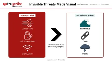
This UNICEF video tackles children's data privacy risks in the digital age — an inherently abstract topic. The breakthrough is symbolic storytelling: invisible digital risks are visualized as physical metaphors — children swept by a data wave. An unseen threat becomes emotionally tangible. The same approach applies directly to B2B videos on cybersecurity, compliance, and risk management, where the danger is real but hard to see.
B2B Corporate Communications & Company Introductions
Example 13 — IDTechEx: Company Introduction
This two-minute video positions a B2B market intelligence firm to busy professionals. Its formula is worth replicating:
- Short duration (respects the viewer's time)
- Structured narration (one idea follows logically from the last)
- Subtle sound design (creates professionalism without distraction)
This combination applies directly to investor communications, employee onboarding, and sales enablement videos where the audience arrives with limited patience — and leaves with a clear understanding of what the company does.
Example 14 — Where Good Ideas Come From (Riverhead Books / Steven Johnson)
This 4-minute video became a viral sensation by making abstract ideas about innovation feel visually and narratively concrete. What drives it: continuous, uninterrupted drawing that builds a complete scene across the entire runtime. Viewers don't realize how much conceptual territory they've covered because the visual momentum never stops — a useful model when the subject matter is dense and the risk of dropout is high.
Example 15 — WWF: New Hope on Climate Change
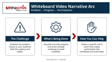
This 2.5-minute video from World Wildlife Fund moves through a three-part structure:
- Here's the challenge — global climate problem established clearly
- Here's what's being done — concrete initiatives visualized
- Here's how you can help — specific call to action
This arc — problem, progress, participation — is a replicable template for any change management or sustainability communications brief. For teams working on audience-activation campaigns, it's a clean model for moving viewers from awareness to action.
What These Examples Have in Common: Lessons for Your Next Video
Start With Clarity, Not Content
Every effective whiteboard animation in this list starts with three questions answered before a single frame is drawn:
- Who is the viewer? (Be specific — "general audience" isn't an answer.)
- What single idea should they leave with?
- What action should they take next?
Teams that skip this pre-production clarity end up with videos that cover too much ground, resolve nothing, and ask for nothing. The examples above — from PadMapper to WWF to Oxfam — each commit to one outcome. That commitment is what makes the viewer do something after watching.
Visual Style Serves the Message
The most effective videos here don't share a visual style. Some use two colors; some use full palettes. Some run 90 seconds; one runs 20 minutes. What they share is that every visual decision — color restraint, character design, drawing pace — serves the message and the audience. Style follows function.
TruScribe's Scribology methodology is built on this principle. Every drawing choice — what appears on screen, when it appears, and how long the eye lingers — is made to move the viewer toward a specific idea, not to fill space.
When to Invest in Professional Production
DIY tools work for low-stakes internal content. But for high-stakes communications — compliance training, product launches, executive presentations, investor briefings — scripting quality, voice performance, and visual design directly determine outcomes.
TruScribe has produced 5,000+ whiteboard videos for more than 1,000 B2B clients, including Microsoft, Google, NASA, and Walmart. The production decisions that made the 15 examples above work — tight scripts, deliberate pacing, purposeful visuals — are precisely what professional production delivers consistently, at scale.
Frequently Asked Questions
What is whiteboard animation and how is it different from regular animation?
Whiteboard animation simulates a hand drawing illustrations in real time, typically accompanied by narration. The progressive construction of the image — not just a white background or sketch style — is what defines the format. Standard animation presents full scenes at once; whiteboard animation reveals content sequentially, keeping viewers actively engaged throughout.
What industries use whiteboard animation videos most often?
Corporate training and L&D, healthcare, financial services, technology, and sales enablement are the most common sectors. The format works wherever a complex idea needs to reach a specific audience clearly — which is why it's just as common in internal B2B communications as it is in external marketing.
How long should a whiteboard animation video be?
Most effective marketing and explainer whiteboard videos run between 90 seconds and 3 minutes. Training videos may run longer when content complexity requires it. Length should follow the message's needs — not the other way around.
What makes a whiteboard animation video effective?
The strongest videos combine a single-focus script, deliberate visual pacing that gives each idea room to land, a voiceover that complements rather than duplicates the visuals, and a specific call to action at the close.
How much does it cost to produce a professional whiteboard animation video?
Professional whiteboard animation pricing depends on length, complexity, and production quality — studios like TruScribe offer per-minute rates and bulk packages for organizations with ongoing volume needs. Request a quote and evaluate it against the communication's ROI potential, not just the upfront number.
Can whiteboard animation be used for internal corporate communications, or is it only for marketing?
Whiteboard animation is equally effective internally. Employee onboarding, compliance training, change management, and executive communications are all strong use cases — and several of the 15 examples in this article were produced specifically for internal B2B audiences.
The examples above show what effective whiteboard animation looks like across formats, audiences, and goals. TruScribe has delivered 5,000+ whiteboard videos for clients including Microsoft, Google, NASA, and Walmart. Connect with TruScribe to turn your next complex message into a clear, memorable video.