
Introduction
Most infographics fail before anyone opens a design tool. The creator had good data, a real idea, and decent visual instincts — but skipped the strategy that separates a memorable graphic from visual noise.
Here's what the evidence shows: researchers at MIT found that the human brain can detect meaning in images presented at 13 milliseconds per picture. Speed of detection, though, isn't the same as comprehension or retention. A well-structured infographic earns both.
A 2021 study published in Arthroscopy found that infographics produced mean Altmetric Attention Scores of 29.75 versus 5.75 for matched research articles — nearly five times higher engagement in a medical publishing context. The gap between a forgettable graphic and a widely-shared one comes down to execution.
This guide covers 10 practical tips across strategy, design, storytelling, and distribution — everything you need to create an infographic that actually communicates.
Key Takeaways
- Start with one defined message; every design decision flows from it
- Verify all data before touching a design tool
- Limit your palette to three colors and two fonts for cleaner, more readable designs
- Structure the content as a story: context, evidence, takeaway
- Publishing is step one, not the finish line — distribution and updates matter
Tips 1–3: Start with Strategy, Not Software
Most infographic failures happen before anyone opens a design tool. The message isn't defined, the audience isn't considered, and the content hasn't been properly vetted — then someone picks a template and wonders why the result doesn't land.
Tip 1: Define Your One Core Message First
Every effective infographic is built around a single, clear takeaway. Not three takeaways. Not a theme. One specific thing the viewer should understand or remember after looking at it.
The simplest way to find that message: ask yourself, "What is the one thing my audience must walk away knowing?" Write that answer in a single sentence before you do anything else.
This principle sits at the foundation of TruScribe's Scribology methodology, which governs how they approach all visual communication — infographics included. Their framework is clear: no visual element is included unless it directly serves the core message. Format follows message, not the other way around.
Audience matters here too. A benefits summary for new employees needs different framing than a sales enablement one-pager for prospects. The same underlying data can produce very different infographics depending on who's reading it and what they already know.
Tip 2: Gather and Verify Your Data Before You Design
Data credibility is the foundation of a useful infographic. The AP Stylebook's data journalism guidance is direct: verify sources, check original data, and avoid drawing causal conclusions from correlation before presenting anything visually.
One inaccurate statistic can undermine the entire piece. A well-known example: a Fox News pie chart displayed values of 70%, 63%, and 60% — totaling 193% — in a format that implied parts of a single whole. Once a flawed infographic spreads, corrections rarely reach the same audience at the same scale.
Collecting data upfront also solves a secondary problem: it tells you which visualization types actually fit your content. You can't know whether you need a bar chart, a timeline, or a flowchart until you know what the data looks like.
Tip 3: Wireframe Your Layout Before You Design
A wireframe is a rough sketch — pen on paper works fine — that maps where each element goes: the headline, each data block, charts, section dividers, and any call-to-action. It takes 15 minutes and saves hours of rework.
Nielsen Norman Group describes low-fidelity prototypes as fast, inexpensive, and easy to revise — specifically because they focus feedback on structure and flow before any visual polish is applied. The same logic applies directly to infographic planning.
A good wireframe accomplishes three things:
- Establishes reading flow (top to bottom, left to right for Western audiences)
- Identifies natural section breaks and visual hierarchy
- Reveals early whether the content is too dense and needs to be cut
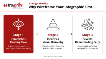
It's much easier to cut a section in a sketch than to redesign a polished layout.
Tips 4–6: Design Principles That Drive Clarity
Every design choice in an infographic is a communication decision. Color, typography, and spacing either help viewers absorb information quickly or slow them down.
Tip 4: Build a Focused, Purposeful Color Palette
A practical starting rule: one background color, two accent colors, and then tints and shades of those three for variety. Going beyond four distinct colors creates visual competition that pulls attention away from the data itself.
Color choice should also reflect tone. Bold, high-contrast palettes work for energetic or consumer-facing topics. Muted, professional palettes suit serious B2B content — financial reports, compliance summaries, executive briefings.
Accessibility matters here. According to the National Eye Institute, approximately 1 in 12 men has some form of color-vision deficiency. WCAG guidelines (Success Criterion 1.4.1) prohibit using color as the sole means of conveying information. The fix is straightforward: add labels, use patterns or icons alongside color, and check contrast ratios with a free tool like WebAIM's contrast checker before publishing.
Tip 5: Choose Two Fonts and Use Them Consistently
Two fonts is the right ceiling for most infographics: one display or heading font that establishes tone, and one clean sans-serif for body text, labels, and captions. Hierarchy comes from size, weight, and placement — not from adding more typefaces.
Decorative or script fonts become illegible fast at small sizes, especially on mobile screens where most infographics are consumed.
Font hierarchy signals importance to the reader's eye:
- Title: Largest, most prominent
- Section headings: Clearly subordinate to the title
- Body text and labels: Small, clean, highly readable
Consistent sizing lets viewers scan the infographic naturally, without pausing to decode what each text element means.
Tip 6: Use White Space Intentionally
White space is not wasted space. It's what allows each element to register clearly instead of competing with everything around it.
Research on online reading layouts (Chaparro et al., 2004) found that generous margins improved comprehension — supporting the case for white space as a functional design element, not a stylistic luxury.
The practical guidance: limit your infographic to 5–6 key ideas maximum. This is where many creators struggle, because the instinct is to include everything. But the more you add, the less the audience retains. An infographic is not a report or a white paper. Pick the six ideas that matter most, communicate those clearly, and stop there.
Tips 7–10: Visual Storytelling, Flow, and Distribution
A technically clean infographic still fails if it doesn't guide the viewer through a coherent sequence — and if no one sees it after it's published. These final four tips address storytelling, data visualization, review, and getting your work in front of the right audience.
Tip 7: Show the Data — Don't Just Write It Out
Any time you have a number, percentage, comparison, or trend, the default question should be "how can this be visualized?" — not "how should I phrase this?"
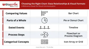
Here's a quick reference for choosing the right chart type:
| Data relationship | Best visual format |
|---|---|
| Comparing values across categories | Bar chart |
| Showing parts of a whole (few slices) | Pie or doughnut chart |
| Dated events or milestones | Timeline |
| Process or workflow steps | Flowchart |
| Categorical ideas or concepts | Icons or illustrations |
Watch out for one common trap: large decorative numbers or headline-style typography used as a substitute for actual data visualization. A "47%" in bold type is not a chart — it's a number in a box. Visualization means showing the relationship, not just styling the statistic.
Tip 8: Structure Your Infographic Like a Story
The most memorable infographics have a narrative arc. A 2021 meta-analysis covering 75 samples and more than 33,000 participants found that narrative texts were generally easier to comprehend and remember than expository ones. That principle applies directly to visual formats.
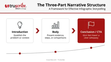
The structure looks like this:
- Introduction — establish the problem or context (why this matters)
- Body — present supporting evidence, steps, or comparisons
- Conclusion or call-to-action — give the viewer a clear takeaway
This is the same foundation behind TruScribe's Scribology method — a neuroscience-backed approach that builds visual stories sequentially, revealing ideas step by step so viewers construct understanding rather than absorbing a data dump all at once.
A technique worth applying: identify the single most surprising or compelling data point and give it visual prominence. Place it centrally or near the end where it lands as a conclusion. That's your hook — the reason someone shares the graphic.
Tip 9: Test It with Fresh Eyes Before Publishing
You are too close to your own content to judge whether it communicates clearly to a first-time viewer. This isn't a criticism — it's just how proximity works.
Before publishing, share a draft with 2–3 people unfamiliar with the subject matter. Ask them one question: "What do you think the main message of this is?" If their answers don't match your intent, the design needs revision — not just proofreading.
That same review pass is also when you verify every number, label, percentage, and source citation. Errors in widely shared visual content are nearly impossible to correct after the fact. The Fox News pie chart from Tip 2 is a useful reminder — a basic arithmetic check would have caught the problem before it aired.
Tip 10: Distribute Everywhere and Keep It Updated
A finished infographic with no distribution plan reaches no one.
Demand Gen Report's 2024 B2B Content Preferences survey found that 84% of buyers shared content via LinkedIn, 78% via email, and 59% valued infographics during early-stage research — up from 42% the year before. Those numbers point to where your infographic needs to be.
Distribution checklist:
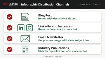
- Embed on a blog post with descriptive alt text (Google recommends alt text that conveys the graphic's key conclusion, not just its title)
- Share natively on LinkedIn and Instagram — don't just link to a post
- Include in email newsletters with a preview image and clear subject line
- Pitch to relevant industry publications that republish visual content
Infographics built on statistics also have a natural shelf life. Set a calendar reminder to review the piece when source data updates — refreshing the numbers is a legitimate reason to re-promote it as new content, because it is.
Common Infographic Mistakes to Avoid
Even experienced communicators make predictable mistakes. Here are the three most damaging ones:
Designing without a defined message — When the core message isn't set before design begins, the result is a cluttered piece that tries to say too many things and communicates nothing clearly. This is the root cause of most failed infographics, and it can't be fixed in the design phase.
Overloading with text and data — An infographic is not a report. The more content you add, the less the audience retains. If everything has to be included, the format is probably wrong for the job — the format's power comes from selectivity, not comprehensiveness.
Skipping brand and accessibility checks — Mismatched colors, fonts, or tone undermine credibility and confuse viewers about the source. Poor contrast, missing alt text, and small type at mobile scale cut your reach. A quick pre-publishing checklist catches both.
When Should You Use an Infographic?
Infographics are not the right tool for every communication need. They work best in specific situations:
Strong use cases:
- Summarizing research findings or survey data
- Explaining a multi-step process visually
- Comparing options or statistics side by side
- Simplifying a complex topic for a general audience
B2B-specific applications: employee onboarding materials, sales enablement one-pagers, training summaries, benefits communications, and executive briefings.
When content is highly sequential, involves causality that unfolds over time, or requires emotional engagement to drive behavior change, a static infographic may not be sufficient. Research supports this distinction: a 2002 review by Tversky, Morrison, and Betrancourt found no general learning superiority for animation over static graphics — unless the animation depicted actual motion or transformation that was central to understanding the content.
For B2B training, change management, or complex product explanation, an animated visual format guides viewer attention step by step through a narrative, controls the sequence of information reveal, and creates active engagement through visual anticipation — things a static infographic cannot do.
TruScribe's whiteboard animation work is built on this principle, using the Scribology method to sequence information for comprehension and retention in exactly these high-stakes contexts.
Start by defining what your audience needs to do with the information: reference it later, follow a sequence, or feel motivated to act. That answer usually points clearly to the right format.
Frequently Asked Questions
What are the tips for designing an infographic?
Start with a single defined message, wireframe before opening any design tool, limit your palette to three colors and two fonts, visualize data instead of writing it out, and structure the content with a clear beginning, middle, and takeaway. Strategy comes before software, without exception.
What are the 5 elements of an infographic?
The five core components are: a clear title, an introduction or context section, the main body (charts, icons, data visualizations, and supporting text), a conclusion or call-to-action, and source citations with branding. Each element serves the overall message — nothing is decorative filler.
What are common infographic mistakes?
The three most damaging: starting design without a defined core message, overloading the graphic with text and data (which reduces retention, not increases it), and neglecting brand consistency or accessibility requirements like color contrast and alt text.
How many colors should an infographic have?
Most design guidance points to three primary colors — one for the background and two for accents — with additional tints and shades of those same colors for variety. This keeps the design cohesive and prevents color from competing with the data.
How long or large should an infographic be?
There's no universal standard — content should determine length, not the other way around. Most effective infographics cover 5–6 key ideas; beyond that, viewer attention drops sharply. If the content requires more, a different format may serve it better.
What is the difference between an infographic and a data visualization?
A data visualization is a single chart or graph representing one specific dataset. An infographic combines multiple visualizations with supporting text, icons, and narrative structure to tell a complete story. Think of visualizations as components and the infographic as the full composition.