Introduction
Many L&D professionals face the same frustrating pattern: completion rates look great on paper, but when it comes to actual behavior change on the job, the numbers tell a different story. A 2025 systematic review of workplace eLearning found no consistent method for measuring training transfer, and a separate analysis found that roughly 80% of transfer studies don't measure actual transfer at all — substituting learner perceptions instead.
The problem usually isn't the content. It's the design.
This article covers the design principles, visual strategies, and engagement techniques that separate courses that drive behavior change from those that just get completed. Whether you're building in-house or partnering with a production studio, what follows covers the specific decisions — from structure and pacing to visual format — that determine whether your training actually transfers to the job.
Key Takeaways
- Effective eLearning starts with learner outcomes, not content checklists
- Cognitive chunking, guided practice, and transfer design are the foundation of courses that stick
- Purposeful visuals reduce cognitive load and improve comprehension — design is a learning tool
- Scenarios and storytelling drive engagement that passive content delivery never achieves
- Microlearning and accessibility are design requirements, not add-ons
What Modern eLearning Design Actually Means
From Content Coverage to Learner Outcomes
Traditional eLearning followed a predictable checklist: write objectives, build content, add a quiz. The implicit goal was coverage — getting through the material. Modern design starts somewhere different. The starting question is what does the learner need to do, decide, or solve?
This shift changes every downstream decision. Objectives become performance-based. Scenarios replace slides. Assessment moves from gatekeeper to learning tool.
Today's effective designer functions more like an experience architect — combining instructional strategy, UX thinking, cognitive science, and storytelling to build courses that change behavior, not just demonstrate compliance.
Why This Shift Matters
| Traditional Approach | Modern Approach |
|---|---|
| Content-first ("what do we cover?") | Learner-first ("what will they do differently?") |
| Objectives, content, assessment | Outcomes, context, experience |
| Quiz as final gatekeeper | Assessment woven throughout |
| Passive consumption | Active application |
| Completion as success metric | Transfer and behavior change as success |
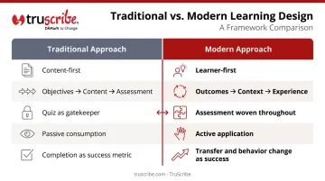
TruScribe's Scribology methodology is built on this same principle. The framework organizes production around how learners actually process and retain information: minimizing cognitive load, building mental models progressively, and keeping the focus on what the learner walks away able to do.
Core Principles of Effective eLearning Design
These principles should govern every design decision, regardless of platform, format, or topic.
Hook and Anticipatory Set
Every module needs an opening that answers the learner's unspoken question: why does this matter to me? Without that answer, disengagement starts before the content begins.
Weak opening: "Welcome to Module 3: Workplace Safety Protocols. In this module, you will learn about..."
Strong opening: "Last year, 47 employees in your facility filed injury reports for the same preventable cause. By the end of this module, you'll know exactly what's behind that number — and how to stop it on your team."
The difference is stakes. The second version earns attention because it's specific, consequential, and personal — the first version doesn't.
Chunking and Instructional Input
Cognitive chunking breaks complex information into smaller, self-contained units. The theoretical basis comes from Mayer's Cognitive Theory of Multimedia Learning: visual and auditory processing channels are separate, each has limited capacity, and learning requires active integration across both.
A meta-analysis of 56 investigations found that meaningful segmentation improved retention (d=0.32) and transfer (d=0.36) while reducing cognitive load. The key word is meaningful — arbitrary shortening doesn't help. Chunk content around ideas, not time limits.
The practical rule: every piece of instructional input should directly serve the stated learning objective. If it doesn't, cut it.
Guided Practice and Active Application
Reading about a skill and performing a skill are cognitively distinct activities. Passive consumption — watching a video, reading a screen — doesn't build the neural pathways needed for real-world application.
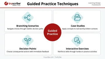
Guided practice gives learners safe opportunities to apply knowledge before they're expected to perform. Examples include:
- Branching scenarios where learners make decisions and experience consequences
- Case studies that apply a framework to realistic, ambiguous situations
- Decision points that prompt reflection before the learner moves forward
- Interactive exercises — drag-and-drop, sequencing, labeling — with immediate feedback
A 117-study meta-analysis of behavior modeling training found that trainee-generated scenarios, goal-setting, and manager involvement produced the strongest transfer effects. The implication: the more the learner authors the experience, the more it sticks.
Closure, Evaluation, and Meaningful Assessment
The "quiz at the end" model treats assessment as a gatekeeper. Modern design treats it as a learning event.
Effective assessment does two things simultaneously: confirms comprehension and reinforces learning. That means weaving assessment throughout the experience rather than front-loading content and testing recall at the finish line:
- Reflective questions mid-module to surface gaps in real time
- Performance tasks that require applying knowledge, not just recalling it
- Scenario-based challenges that mirror the complexity of actual work
Transfer: Designing for Independent Application
The ultimate test of any training: can the learner apply what they learned without the course open in front of them?
Transfer design strategies include:
- Scenarios that mirror actual job contexts — not sanitized textbook versions
- Job aids and quick-reference tools learners can use post-training when they need support
- Performance support resources embedded at the point of need
- Spaced reinforcement through follow-up nudges, retrieval prompts, or short refresher modules
Supervisor and peer support, and the opportunity to actually practice the new skill on the job, matter just as much as the course design itself. Transfer is a system, not a module.
Visual Design Strategies That Boost Comprehension and Retention
Visual Design Is a Cognitive Tool
The most common mistake in eLearning visual design is treating it as decoration. It isn't. Every visual decision — layout, color, typography, motion — either reduces or increases the cognitive load the learner carries while processing new information.
Mayer's coherence principle is clear: learning improves when extraneous material is removed. Decorative graphics, irrelevant animations, and cluttered layouts don't just fail to help — they actively compete for the limited processing capacity learners need to encode new information. The goal isn't a beautiful course; it's a clear one.
Key principles for effective eLearning visual design:
- Clean, minimalist layouts — empty space is an active design tool, not wasted space
- Limited, purposeful color — use color to direct attention, not to decorate
- Consistent typography — visual hierarchy should guide the eye, not create noise
- Meaningful imagery — every visual should advance understanding; stock filler undermines it
The Power of Sequential Visual Storytelling
Presenting all information simultaneously forces the learner's brain to filter and prioritize competing visual elements. Sequential revelation (introducing ideas as they build on each other) directs attention with precision and paces information delivery to match how the brain constructs understanding.
A meta-analysis of 103 signaling studies found that cues identifying structure and essential material improved retention (g=0.53) and transfer (g=0.33) while reducing cognitive load. How information is revealed matters as much as what is revealed.
This is the core cognitive rationale behind TruScribe's Scribology method. By drawing content progressively, one element at a time, the viewer's eye has exactly one place to look at any given moment. There's no visual competition. Each idea is processed before the next is introduced.
That sequential mechanism activates what TruScribe calls "visual anticipation": the learner's brain engages actively with content as it unfolds, rather than passively consuming a completed slide. TruScribe reports 2.3x higher retention compared to traditional video formats using this approach.
Static vs. Immersive Visual Experiences
Dense, text-heavy slides place the burden of attention management on the learner. Immersive visual experiences build that management into the design itself. The format you choose determines how much cognitive work the learner has to do before the content even registers.
| Format | Best Used For | Cognitive Benefit |
|---|---|---|
| Illustrated scenarios | Emotional engagement, decision-making contexts | Activates empathy and contextual reasoning |
| Icons and diagrams | Process flows, relationships, comparisons | Reduces text load, speeds pattern recognition |
| Data visualization | Trends, scale, before/after comparisons | Makes abstract numbers tangible and scannable |
| Sequential animation | Complex concepts, step-by-step processes | Paces delivery to match how the brain builds models |
| Card-based layouts | Microlearning, mobile delivery, single-concept focus | Prevents overload; one idea processed at a time |
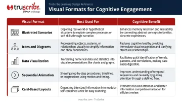
Card-based and responsive visual design present one idea per block, which prevents cognitive overload and supports scanning. They also adapt to mobile screens without requiring a full redesign — a practical advantage as learner device habits continue to shift.
Driving Learner Engagement Through Interactivity and Storytelling
Interactivity and Higher-Order Thinking
Clicking "next" is not interactivity. Real interactivity requires learners to analyze information, evaluate options, or apply judgment — engaging higher-order cognitive processes rather than passive recall.
The spectrum of interactivity runs from simple (clicking to reveal information) to complex (full simulations with branching consequences). Match the interaction type to the learning objective:
- Knowledge check → Multiple choice with meaningful feedback
- Application → Scenario with decision point and consequence
- Analysis → Case study requiring evidence-based recommendation
- Evaluation → Simulation with realistic constraints and ambiguity
Scenario-Based Learning
Scenarios are the most powerful engagement tool available to eLearning designers. They create emotional stakes, establish relevance, and make abstract concepts feel real. A well-designed scenario structure:
- Set up the situation — place the learner in a recognizable context
- Present a decision point — force a choice with no obviously correct answer
- Show a consequence — make the outcome of their choice visible and real
- Facilitate reflection — ask what they'd do differently and why
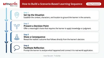
Meta-analyses of behavior modeling and safety training consistently favor realistic scenarios, practice, and feedback over passive lecture-style delivery.
Gamification Done Right
Gamification works when it reinforces the learning behavior, not when it distracts from it. Progress indicators, challenge levels, and narrative arcs can drive motivation. Tangible rewards tied to completion, though, can actually reduce intrinsic motivation for tasks learners already find meaningful.
The KPMG case makes this concrete: a voluntary game where employees answered service questions and advanced through levels was associated with 35.8% more fees collected, 16.3% more clients, and 22.3% more opportunities from new clients. Effects were strongest where both employee and leader participation was high. Gamification doesn't do the work alone; it amplifies what's already working.
That motivational dynamic connects to something deeper than points and badges. Narrative structure gives learners a reason to care — and a framework for retaining what they learn.
Narrative as Organizational Framework
Storytelling isn't just a technique for individual scenarios. Used at the course level, narrative structure (setup, conflict, resolution) gives learners a cognitive "spine" on which to hang new information, improving both recall and emotional engagement.
A meta-analysis of 37 studies and over 33,000 participants found that narrative texts outperformed expository texts for both comprehension (g=0.48) and memory (g=0.72). Those are substantial effects, consistent across varied study conditions.
TruScribe's Scribology method applies this directly: sequential storytelling moves learners from attention to understanding to action, with every visual element serving the core narrative rather than decorating it.
Designing for Today's Workforce: Microlearning, Mobile, and Accessibility
Microlearning as a Design Strategy
Microlearning (short, focused modules addressing a single learning objective) aligns with how modern employees actually consume information. ATD's 2025 research found 66% of talent development professionals now use microlearning, up 28 percentage points from 2017.
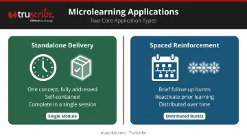
Two distinct applications:
- Standalone delivery for discrete skills, where a single module covers one concept completely
- Spaced reinforcement paired with longer courses, using brief follow-up bursts to reactivate prior learning over time
The most effective duration depends on the objective, not a universal standard. If the concept is fully addressed in 4 minutes, the module ends at 4 minutes. Padding a module to hit an arbitrary target dilutes the content and loses the learner.
TruScribe's standard production format of 3-minute videos reflects this philosophy. Their bulk packages are built around short-form content because that's what the research supports, not because it's convenient to produce.
Mobile-First Design
Responsive design starts with the smallest screen. Practical mobile-first principles:
- Favor scrolling over clicking — it's more intuitive on touch screens
- Limit interactions to thumb-friendly gestures
- Use high-contrast visuals
- Strip out hover states, which don't exist on mobile
- Ensure content is accessible without Wi-Fi
The minimalist, single-idea-per-screen approach that defines good eLearning visual design translates naturally to mobile. That's why card-based and sequential formats perform consistently well across device types.
Accessibility as Inclusive Design
Accessibility is not optional. WCAG 2.2 (the current W3C recommendation) sets direct requirements for eLearning content:
| Requirement | WCAG Level |
|---|---|
| Prerecorded captions | A (1.2.2) |
| Audio description for video | AA (1.2.5) |
| Text contrast ≥ 4.5:1 | AA (1.4.3) |
| Keyboard navigation | A (2.1.1) |
| Reflow at 320 CSS pixels | AA (1.4.10) |
| Minimum target size | AA (2.5.8) |
The WHO estimates 1.3 billion people — 16% of the global population — experience significant disability. Accessible design improves the experience for all learners: captions help in loud environments, high contrast aids outdoor viewing, and clear navigation benefits anyone on a small screen.
TruScribe offers ADA-compliant captioning and localization services as part of its production offering, including multilingual subtitles for global training deployments.
Frequently Asked Questions
What are the most important principles of eLearning design?
Start with learner-centered goals — what should learners do differently after the course? Build from there using cognitive chunking, guided practice, meaningful assessment, and transfer design strategies. The platform and format are secondary; the learning outcome is what drives every decision.
How do you keep learners engaged in online courses?
Engagement comes from relevance, interactivity, and narrative. Scenarios that create real stakes, decision points that require analysis, and content chunked into focused moments replace passive sequences that lose attention within the first few minutes.
How long should a modern eLearning module be?
Most modules should run 5–15 minutes per unit; microlearning modules run shorter, around 3–7 minutes. The real answer: length should follow the learning objective. A concept fully addressed in 6 minutes doesn't need to stretch to 15.
What is the difference between instructional design and eLearning design?
Instructional design is the broader discipline — analyzing learning needs, selecting strategies, designing experiences across any medium. eLearning design applies those principles in a digital environment, and without that instructional foundation, courses may look polished but fail to actually teach.
How does visual design affect eLearning effectiveness?
Visual design directly impacts cognitive load. Clean, purposeful visuals reduce extraneous processing and free mental capacity for actual learning. Cluttered or decorative design competes for attention and slows comprehension — regardless of how good the underlying content is.
What makes eLearning content easier to remember?
The strongest retention strategies: spaced repetition (revisiting content at intervals), retrieval practice (active recall rather than re-reading), emotional engagement through storytelling, and reducing cognitive overload so information encodes into long-term memory instead of being filtered out.