Infographics are one of the most effective tools for that shift. They take dense, complicated information and transform it into something people can scan, absorb, and actually remember — which matters enormously in B2B environments where your audience is busy, skeptical, and won't give you a second chance if the first impression is confusing.
This post covers everything you need: a clear definition, the cognitive science behind why visuals work, the main types of infographics with examples, the essential elements of a strong design, and practical tips for creating infographics that do real work.
Key Takeaways
- An infographic combines imagery, data, and minimal text to communicate complex ideas quickly and clearly
- The brain detects meaning in images in as little as 13 milliseconds — visual processing is fundamentally faster than reading
- Format choice is critical — the wrong infographic type for your content structure will undermine the message
- Strong infographics share five core elements: visual hierarchy, accurate data, clear graphics, consistent typography, and concise copy
- Sequential, layered topics often need motion-based formats — whiteboard animation handles what static infographics cannot
What is an Infographic?
An infographic is a visual representation of information, data, or knowledge that combines imagery, charts, icons, and minimal text to present complex ideas quickly and clearly. Merriam-Webster defines it as "a chart, diagram, or illustration (as in a book or magazine or on a website) that uses graphic elements to present information in a visually striking way." The word itself is a compound of information and graphics, with first documented use traced to 1979.
More Than a Chart
An infographic is not a standalone chart or raw data dump. The distinction matters. A chart shows data. An infographic tells a story with that data. It has a narrative structure, a clear hierarchy, and a takeaway the viewer leaves with.
Every infographic contains three layers:
- Visual layer — colors, graphics, icons, and illustrations that create the aesthetic experience
- Content layer — the underlying data, facts, and statistics being communicated
- Knowledge layer — the insight or conclusion the viewer should reach after engaging with the piece
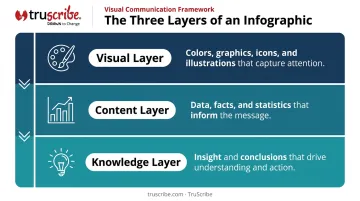
Strip away any one of these layers and what remains is incomplete — data without context, or visuals without meaning.
A Concept With Deep Roots
Visual information design is not new. Florence Nightingale used what she called a "polar area diagram" in the late 1850s to show British MPs the preventable causes of military mortality during the Crimean War. Color-coded and spatially organized, it was far more persuasive than a table of numbers.
John Snow's 1854 cholera map clustered outbreak deaths around the Broad Street pump to identify the likely source of contamination. Neither piece was decorative — both were arguments made with visuals.
What's changed is who can make one. In Nightingale's era, producing a data visualization required statistical training and physical printing. Now the main requirements are a design tool and something worth saying.
Why Infographics Work: The Science of Visual Communication
The Brain Processes Images Remarkably Fast
Research by Potter, Wyble, Hagmann, and McCourt found that participants could detect the meaning of images presented in rapid sequences at durations as short as 13 milliseconds per picture. That's not a typo. The visual system is extraordinarily efficient at extracting meaning — far faster than reading requires.
A well-designed infographic communicates a key fact in a single glance. That same fact buried in a paragraph demands active reading time your audience may not give you.
Dual Coding: Two Memory Traces Are Better Than One
Allan Paivio's dual coding theory, first published in Imagery and Verbal Processes (1971), describes how the brain maintains distinct but connected verbal and imagery processing systems. When information arrives through both channels simultaneously — a concept shown visually and described in text — it creates two memory traces rather than one.
The result: infographics that pair meaningful visuals with concise labels are remembered more reliably than text-only content, because they engage both systems at once.
Cognitive Load Reduction
Richard Mayer's research on multimedia learning demonstrated that working memory has a limited capacity, and that coordinating related words and images reduces the extraneous processing burden on the learner. Mayer reported a median effect size of 1.12 for spatial contiguity — meaning that placing related visuals and text near each other meaningfully improves learning outcomes.
Infographics put this into practice by organizing information spatially. Specific techniques include:
- Chunking related points into distinct visual sections
- Using icons to replace wordy labels
- Grouping connected data so relationships are immediately visible
For B2B audiences reading under partial attention — skimming between meetings, reviewing on mobile — that reduced cognitive effort is the difference between a message that lands and one that's skipped.
Visual Hierarchy Directs Attention
Size, color contrast, and positioning don't just make a design look better — they control where the eye goes first, second, and third. A strong infographic uses these tools deliberately, ensuring the most critical information registers before anything else. Nielsen Norman Group's guidance confirms that color palettes and contrast reinforce hierarchy when applied consistently — and that visual clutter actively slows comprehension.
Types of Infographics: Choosing the Right Format
Choosing the wrong infographic format is one of the most common mistakes communicators make. A timeline applied to comparative data, or a statistical layout applied to a process, creates friction instead of clarity. The format has to match the structure of the information itself.
Statistical Infographics
These are built around data: charts, graphs, big numbers, and icons that spotlight key facts. They work best when the numbers are the message — research reports, annual summaries, industry benchmarks, and survey results all fit this format well.
Timeline Infographics
Ideal for chronological progression: company history, project milestones, or the evolution of a market. Use a timeline when dates and sequence matter. Use a roadmap format when you're showing stages and goals without fixed dates.
Process Infographics
Visualize step-by-step sequences: onboarding workflows, how-to guides, safety protocols, compliance procedures. Especially common in HR, L&D, and operations. The defining characteristic is that the order of steps matters — readers need to follow the sequence, not scan it freely.
Comparison and List Infographics
Two of the most versatile formats in content marketing and internal communications:
- Comparison infographics present a side-by-side evaluation of options — products, plans, approaches — helping the audience reach a decision
- List infographics give visual form to tips, rankings, or curated resources, and tend to perform well for social sharing and email campaigns
TruScribe's Three Infographic Styles
Beyond these standard categories, the format choice gets more nuanced when you factor in how connected your information actually is. TruScribe's custom infographic work organizes formats around the nature of the message — not just the data type:
| Format | Best For |
|---|---|
| Blocked | Lightly connected facts that each stand alone — sales decks, marketing stats, poster content |
| Mapped | Highly connected information where relationships and flow are central — workflows, process diagrams, decision trees |
| Scenic | A unified illustrated framework where big-picture context matters — strategic narratives, patient journeys, complex ecosystems |
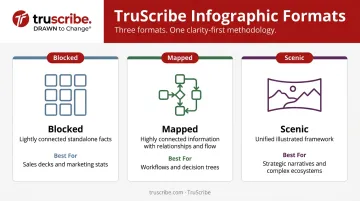
A process diagram with eight interdependent steps calls for a Mapped approach. A poster listing five product benefits calls for Blocked. Picking the wrong one doesn't just affect aesthetics — it affects whether readers actually follow the logic.
Infographic Examples Across B2B Use Cases
Employee Training and Onboarding
Process infographics are a natural fit for HR and L&D teams. A new hire onboarding infographic can map out the first 30 days, explain benefits enrollment, or visualize company culture pillars — all in a format that distributed teams can access without sitting through a meeting.
TruScribe has produced culture and orientation content for organizations including Walmart, Amedisys, and Navistar, helping large, dispersed workforces absorb complex internal information in a consistent, memorable format.
Healthcare and Life Sciences
In clinical settings, visual simplicity isn't a preference — it's a safety consideration. A medical guidance infographic that turns a dense protocol into clear visual steps for clinical staff reduces misinterpretation risk.
A 2018 randomized study by Buljan et al. comparing infographic summaries against text-based plain-language summaries found that infographics received significantly higher ratings for reading experience (d = 0.48) and user-friendliness (d = 0.46) — meaningful advantages in environments where communication barriers to compliance are a real problem.
TruScribe has worked with clients across life sciences on communications addressing clinical processes, device education, and drug development — contexts where the Scenic infographic format's holistic framework is particularly useful. Past partners include:
TruScribe has worked with clients across life sciences on communications addressing clinical processes, device education, and drug development — contexts where the Scenic infographic format's holistic framework is particularly useful. Past partners include:
- Merck
- Medtronic
- Baxter
- Catalent
Marketing and Sales Enablement
For marketing teams, infographics solve a common problem: research findings and product comparisons matter, but nobody reads a five-page report before a sales call. A statistical infographic can summarize ROI data or product differentiators in a format that works in emails, landing pages, or sales presentations.
TruScribe's Blocked infographic format is built specifically for this use case — discrete, high-impact facts arranged for quick comprehension, giving sales teams a visual asset that opens dialogue rather than substituting for it.
The Key Elements of an Effective Infographic
Every strong infographic needs these structural components:
- Headline — hooks the reader and signals the topic immediately
- Explainer line — one brief sentence setting context below the headline
- Section breaks — icons, color bands, or dividing lines that chunk the information visually
- Call to action — a clear next step at the bottom (visit a URL, download a report, contact a team)
- Cited sources — listed at the bottom; non-negotiable in professional and regulated industries
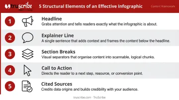
These structural pieces set the foundation. The visual design layer — typography and color — is where that structure comes to life.
Typography and Color
The Interaction Design Foundation recommends using two to three typefaces maximum in any design. A practical B2B infographic typically uses:
- A bold title font for the headline
- A secondary font for section headers
- A simple, highly readable body font for labels and data
For color, Nielsen Norman Group recommends limiting palettes to three colors, following a 60-30-10 distribution: dominant background color, secondary color for section structure, and an accent for key data points. WCAG accessibility standards also require that color is never the only way information is conveyed — patterns, shapes, or text must carry the same signal for colorblind viewers.
Citing Your Sources Correctly
Every statistic in your infographic needs a source — and that source needs to be visible. In healthcare, financial services, and legal contexts especially, audiences will scrutinize citations before they trust your data.
At minimum, source attribution should include:
- The organization or publication that produced the data
- The year the data was published or last updated
- A short URL or report title readers can verify independently
Infographic Design Tips for Clarity and Impact
Show, Don't Tell
Every data point or concept that can be visualized — as a chart, icon, or illustration — should be. Supporting text should be minimal. If your infographic has more copy than a blog post, it's not an infographic anymore; it's a formatted document.
A practical test: if you removed all the text, would the core message still be visible? If yes, you're in good shape. If not, the visuals aren't doing enough work.
Use Contrast and White Space Deliberately
Two tools that B2B communicators consistently underuse:
- Contrast — dark elements on light backgrounds, bold colors for key data points — guides the eye and creates emphasis without adding clutter
- White space — breathing room between sections reduces cognitive overload and makes the design feel organized rather than cramped
Nielsen Norman Group's UX research confirms that grouping related controls through white space reduces user effort and response time. The same principle applies to infographic sections. Don't fear the empty space — it's doing real work.
Know When a Static Infographic Isn't Enough
A static infographic presents all information simultaneously. The reader self-navigates: they can jump to the bottom, skip sections, or miss the logical flow entirely. For many communication goals, that's fine.
For multi-step technical processes, layered organizational change, or nuanced product explanations, sequence matters. When step 3 only makes sense after step 2, a static format has a real ceiling.
This is where whiteboard animation works differently. TruScribe's Scribology method is built around guided sequential disclosure: information unfolds in a deliberate order, with continuous motion directing attention to exactly the right place at exactly the right moment. Viewers can't skip ahead because the story is being drawn in front of them in real time.

That's a fundamentally different cognitive experience. For complex B2B communications, it produces meaningfully better retention and comprehension than a static format can.
The two aren't competitors. They serve different communication structures. The right question is: does your audience need to scan the information, or do they need to be led through it?
Frequently Asked Questions
What is an example of an infographic?
A step-by-step onboarding guide for new employees, a chart visualizing industry survey results, or a side-by-side comparison of product features are all classic infographic examples. Each combines visual structure with data and minimal text to communicate a complete idea quickly.
What are the three types of infographics?
Statistical, timeline, and process infographics are three of the most common. Statistical infographics spotlight data and numbers; timeline infographics show chronological progression; process infographics visualize step-by-step sequences where order matters.
How is an infographic different from a chart or graph?
A chart or graph is a single data visualization. An infographic combines multiple visual elements — charts, icons, text, illustrations — into a cohesive piece designed to tell a complete story, not just display one data point.
What should every infographic include?
A clear headline, a brief introductory line, visual section breaks, supporting data with accurate citations, and a call to action. Each element earns its place — leave one out and readers either lose the thread or reach the end with no direction.
When should you use an infographic instead of a written document?
Choose an infographic for quick comprehension, digital sharing, or making data accessible to a non-specialist audience. Stick with a written document when depth, formal reference, or a detailed argument is required.